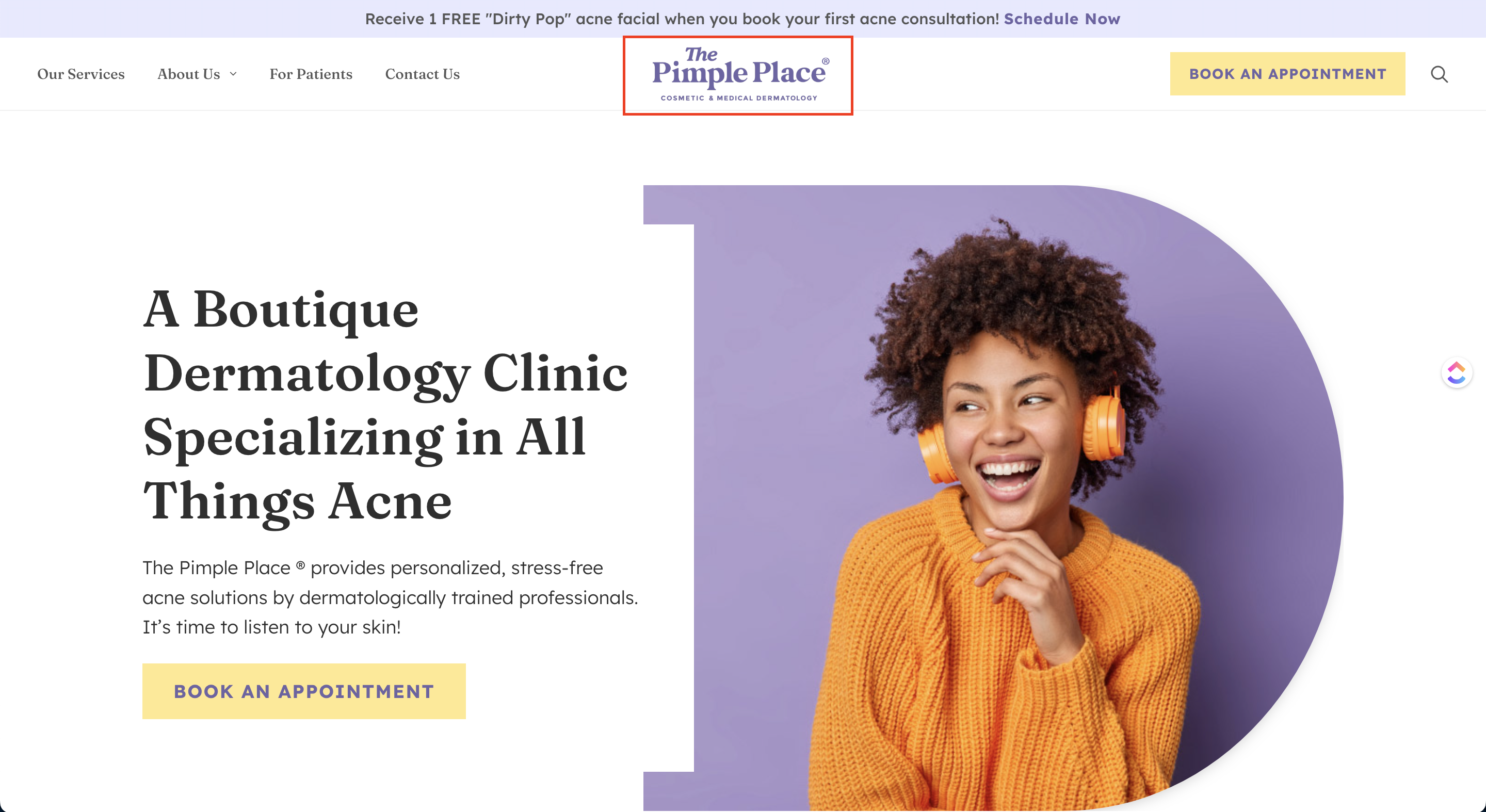
Dear Med Spa Owners of the world – everybody makes mistakes! When it comes to the realm of med spa website design, there’s no exception to the rule. Many med spa websites contain mistakes that are so subtle that we overlook their impact in the grand ‘marketing’ scheme of things. It’s nothing to be ashamed of. Mistakes lead to the active pursuit of solutions, and boy, do we have solutions! Marketing is like math in that way. It’s always finding the problem and looking for the right solution…. which leads us to the point of this entire blog. You’re here looking for answers because you are someone who truly cares about your business. And we applaud you for that — not a lot will admit to needing help, let alone making a mistake. From the title alone, we’re assuming you’ve opted in because you have a website but aren’t generating the results you want, or maybe you are but you just want to make sure you aren’t committing those 4 common mistakes. Either way, these four concepts are for you. We all know the future of business is online; and it’s only right that you, your business, and your website reap the benefits that come with this relatively new platform. Before we point out the 4 common website mistakes, we’d like you to see the value of your website. It’s more important than you think. Your website is your clinic online, and users who visit your site and see a dated and cluttered page will immediately assume your clinic looks that way in person too. So take care of your website as if it were your physical clinic. None of these golden nuggets will help you generate results if you don’t take your website seriously. With that in mind, it’s time to look at the 4 common web design mistakes med spas make, and what you can do to fix them. As a business owner, it’s only natural that you feel overwhelmed with all the factors that go into building a business — so much so that creating a logo might not be a top priority. You might even have a little voice in the back of your mind whispering: “Maybe I don’t need a logo, people won’t mind or notice.” Stop! Don’t listen to that voice; consider that voice your inner saboteur. We’re telling you now — your business needs a logo. Typically, a logo is one of the first things we see upon opening a website. And without it, the website just seems a little.. bland. Choosing not to have a logo might seem like a small thing in your entire business structure, but trust us when we say these small things can make or break your business. It’s just like the butterfly effect. A small change can result in large differences in a later state. Having a logo is an integral part of making your business a successful one. We’ve seen thousands of clients take this for granted, and it normally doesn’t bode well. A logo is important because it attracts attention, creates a positive first impression, serves as the cornerstone of your brand identity, is memorable, distinguishes you from the competition, develops brand loyalty, and is expected by your target audience. Aside from that, it communicates ownership, quality, and values. It’s engraved on your products, business cards, websites, social media, and, most importantly, in your clients’ minds. Your logo is likely to be one of the first things people see when they come into contact with your business, and it’s your chance to make a good first impression, demonstrate that you provide outstanding service, and visually communicate your purpose. A good logo is distinctive, appropriate, practical, graphic, and straightforward in design. A successful logo generally also has a concept or “meaning” that communicates your intended message. You should be able to reproduce your logo at any size and, in most situations, be effective even without color. A great logo is made up of two elements: a smart concept and excellent execution. When it comes to logo design, we think it’s best to work with professionals, like us, to create a custom logo for your brand. Professional designers have the skills and experience to create a logo that speaks to your target audience and represents the solidity and reputation of your company. Plus, your logo will appear on your website, social networking platforms, and a variety of other marketing platforms, and it will play a significant role in promoting yourself and your company. Once you have your awesome logo, it’s time to add it to your website. Again, a logo is important because it’s often a visual representation of the “impression” you want to leave on your visitors. And according to our resident Senior Graphic Designer, Laurice Jara, the best place to add your logo is on the top left corner of your website. Why? This shouldn’t be a shock to you, but most people read from left to right. This makes it a great rule of thumb, as it ensures it’s the first thing visitors see on your website. Another great place to add your logo is at the center because, more often than not, it’s going to be right below the URL/address bar of your browser. Whichever place you wish to add your logo, left or center, be sure not to take this brand asset for granted. Logos have a symbolic imprint on a human’s memory, so you want your logo to be memorable. Remember, it’s the symbol of your brand. It represents the heart and soul of your company on your website, marketing materials, social media posts, and so much more! The second thing we’ve noticed on most med spa websites is the lack of contact information. Website visitors must see your contact information as soon as they decide you’re the proper fit for them. It will be frustrating for a visitor to take the time to open your website only to see the lack of contact information. If you don’t have the information they need to contact you on your site, they might as well leave and look for different med spas that do have their contact information. We suggest adding your contact information on the upper right side of your navigation bar so visitors have easy access to your company’s phone number. You should also have a separate “Contact Us” page that’s easily accessible, and you should include your contact information at the bottom of every page. If you take a closer look at the example above, you’ll notice that there’s a button on the right side corner of the page with the company’s phone number. This is for easy access when visitors are ready to get in touch with the company right away. We made sure to highlight and make the contact information stand out by adding a different colored/contrasting background. If you look at the example again, you’ll also see a separate “Contact Us” page next to the button that visitors can click so they’re redirected to a contact page. All of your contact information should be on the contact page itself. There should be one page with all the contact information for your business, no matter how big the company is or how complicated you believe it is. Med Spa Website Design 101 – What to include on the contact page: Optional: Often you can expect a “Contact Us” page to look like this: Or it can have a form and look like this: Finally, you should add your contact information at the footer of your website. In case you didn’t know, the footer is located at the very bottom of the page. The content there should be in a smaller font size compared to the rest of the text, like this: If you have any questions about this med spa website design strategy, and how you could implement it for your own site, reach out! The third most common med spa website design mistake we see is a case of terrible (and sometimes entirely nonexistent) calls to action. If your website is lacking a call to action (CTA) button, then you’re making a grave mistake. A CTA button directs your visitors to take action (ie. Click here! Get a discount! Find out more about this product). Your CTA must tell visitors exactly what you want them to do. If you want them to buy a product your CTA should go along the lines of “Buy now” or “Click here to purchase.” But if you’re a business that needs your visitors to book a consultation or schedule an appointment it should be something like “Call now” or “Book an appointment today!” There should be enough information for visitors to understand what they will get from taking action and what information they will be required to supply. However, it’s important to note that there’s a thin line between being helpful and being annoying. Don’t overdo your CTAs, think of websites with multiple in-your-face CTAs, or else your visitors will end up frustrated. So this is something you need to be strategic about. In the example above, you can see 2 CTA buttons that are designed to stand out. The design uses contrasting colors with the text and the button itself, while still being on brand. The psychology behind the call to action is intriguing, as it covers width, color, border size, copy, and great CSS effects. But the psychology behind it entails a lot more than that. We make significant gains ahead in our effectiveness as marketers when we grasp the psychology of the call to action. Knowing the psychology of the call to action is equivalent to being a conversion optimization expert because psychology is at the heart of the science and art of conversion optimization for med spa website design. You will significantly enhance your power if you understand a little bit about the psychology that drives/motivates our actions and behavior. Here are some of the psychological principles that power the CTA: The perceptual set theory describes how the mind perceives things. Selecting, inferring, and interpreting are three perceptual processes that the mind employs while considering things, people, and events. This three-step method molds expectations and powers motivation. Users expect to see a call to action when they visit your website since it’s what they’re used to. Don’t get us wrong, this does not imply that they will convert. It just means that their brains are ready for the experience of being called to action. They’re expecting it. They’ve already made up their minds that there will be a CTA. Behavior is influenced by expectations. That is why individuals are aware of the need to respond to the CTA. Our TIP to properly employ this psychological phenomenon is to make your CTA stand out. Make it obvious by using contrasting colors and highlighting it with a different colored background. Several ideas have been proposed by psychologists to explain curiosity. Curiosity, like other drives, can be ‘satisfied’ by repeated exposure to stimulus materials; this is all according to the drive theory of curiosity. Trying to figure out what occurs after the CTA is a fascinating subject. The reality is that we are certain to obtain information, confirmation of a product, or anything else. As far as it goes, categorical knowledge is useful. What we don’t know, though, is what makes us want to click that button. TIP: Use CTA copy that promises a discovery or a breakthrough, a secret, a mystery, or anything similar that will provide the user with previously unattainable knowledge. And just like Pavlov’s dogs, we have the same reaction toward CTAs. The reward that comes after we click on the CTA triggers an operant conditioning reaction in us. Our mental history has taught us that clicking or signing up for anything gives people a feeling of accomplishment. We can’t help ourselves since our neuronal pathways are so worn and smooth. We easily click, convert, and wait to be rewarded. TIP: Use reward-based language in your CTA. Promising a reward might increase the desire to acquire it, resulting in higher CTRs. Size & Shape – When building a CTA button, there are three things to consider: size, shape if it’s tested, and clickable. When it comes to the shape of a CTA button, rectangular buttons are the most common. But because our brains are wired to avoid pointed objects, give that rectangle some beautiful rounded edges. Buttons should also be large enough to be readily tapped with a mobile device. Finally, once you’ve added the button to your page, test it and make sure it works. Colors – Color is one of the most important aspects in determining whether or not someone will click on a CTA. There isn’t a magic color that converts visitors the best, so just pick a color for your CTA button that stands out from the rest of your site; one that’s sure to attract attention. The colors orange and blue are popular and are quite effective. You can also opt for a color that elicits an emotional response. Green, for example, is universally understood to represent “go,” which is a good thing when it comes to CTAs. It’s also the easiest hue for the eye to comprehend, calming the mind and encouraging growth. Orange is thought to promote quick action and is related to low-cost merchandise and impulsive purchases. Copy – Without enticing and actionable copy, a CTA is useless. Copy is what motivates someone to act right away and tells them what to do next after reading the content on your website. It has to be both enticing and unique. Instead of “Click Here,” use “Book a spa day,” and utilize active verbs like “Start” and “Get” to grab people’s attention. The word “now” added to a CTA button increases conversion by instilling a feeling of urgency. Another tip is to use first-person language for better conversion rates. Placement – Finally, we have placement. Placement is an important element in CTA buttons because you don’t want your CTAs to compete for your visitors’ attention and cause them to become confused. Make the action you want them to take crystal clear. If you place CTA buttons above the fold, your visitors will see them even if they are only skimming your website or email. Visitors spend over 80% of their time above the fold, so adding a CTA here will help you capture those ready to act immediately without requiring them to scroll to the bottom of your website. Making your CTA stand out from the rest of the page is as simple as adding white space around it. Simply add padding above and below the button, but not so much that it appears awkward; just enough to give it some breathing room. This should draw the eye in without seeming crowded or lost in a sea of white space. Testing – Most businesses wouldn’t think of this as an element, but it essentially is. No two businesses are the same. This also means no two businesses have the same target audience. It differs from business to business, so testing becomes a routine part of creating CTAs. What will work for your competitor might not work for you. Play with the button shape, size, colors, copy, and placement until you finally get the desired results you want. Med spa website design isn’t easy to figure out through a blog – we get it. We’d be happy to talk to you about your website and your needs. Talk to someone, or read more med spa marketing strategy here. The last common mistake we see with med spa websites is the lack or abundance of elements on a website. Too little Let’s start with the former. Minimalism is a significant design trend, and it works when done properly. But some med spa websites take it too far. The website ends up looking barren when there’s close to nothing there. Some of the websites we’ve seen were unnecessarily obscure, leaving too much to the imagination. Here’s the thing, your visitors go to your website in search of value. They want to gain something from your website. Your visitors are curious about who you are and what your company can accomplish for them. If you rely too much on simple imagery with no clear direction, you’ll leave your visitors guessing, which isn’t good. They’ll end up thinking you don’t offer much to solve their problems, have limited services, and possibly have an overly bare clinic. Just enough to be all over the place The feared “confused brand” website exists somewhere in the middle of the too much/too little range. There’s just about enough of everything, it’s just that there’s nothing to tie them together. The confused site has a wide range of fonts, graphics, color palettes, and services — with none of them being connected. This can happen for a variety of reasons, like when you don’t have a clear picture of your brand image. When you have too many design templates that you want to use, it’s easy to slip into this trap. It can also happen if you’re attempting to express too many concepts at once and viewing your site in pieces rather than as a whole. Our tip is to choose one theme, one logo, and one typeface when creating a website, and stick with it throughout the rest of the site. To tell you the truth, websites with too much flourish don’t succeed in getting more conversions. If your website is trying to do too much, then you’re doing it wrong. Visitors who can’t understand what your site is about within a few seconds of arriving on your site will leave. Too many businesses cram too much information inside a website to appear “extra.” Websites that include a lot of photos, content, services, and other elements will take a long time to load and can confuse your visitors. Avoid busy designs and overcrowding your website at all costs. Only include important company information that visitors might need. One way to optimize your website (and your business) is to specialize in a niche. Because remember: Doing “more” doesn’t necessarily equate to earning more. Too many med spa owners make the mistake of including too many services in their roster. This results in business owners being short on resources and becoming generally unorganized. Even hiring a range of employees to deliver a variety of services. One of your goals should be to avoid being a “generalist”. Specializing in a particular service or market allows you to focus your marketing efforts and get faster results. Focusing on one unique service rather than delivering a wide range of subpar services can help you establish a reputation as an expert. This will help you stand out from your competitors and improve the effectiveness of your campaign. Niche marketing is limited to a single submarket and demand. People in that submarket are more likely to recognize you as the perfect med spa for them, making it easier for new clients to choose your clinic. As a result, you’ll spend less time trying out different strategies and more time acquiring clients. Choose a service that suits your strengths and focus on high-value, high-profit services with recurring revenue. Once you decide, it’ll be much easier to attract clients who need that service and are willing to pay you what you’re worth. Choose a specialization, commit to it, and let your website reflect that. This is a med spa website design “hack”! Again, you don’t have to include too much on your website. Just enough, but make sure what you do include in your website all ties in together. Are you willing to put the time and effort to improve your website, and therefore, generate results? Here at Just Digital Inc, we go the distance for our clients the same way you go the distance for your business. We care about your results and business as if it was our own which is why we always offer med spa website design and development services to elevate your online presence in an increasingly digital world. Our custom websites provide an exceptional experience for your target market and position your company exactly where you want it to be. After being in business for over 10 years and helping thousands of businesses create beautiful websites that pack a good marketing punch, we know a thing or two when it comes to designing a good website. Again, med spa website design isn’t ultra-complicated… but you have to nail it to make money from your website. If you’re ready to grow your business a bunch, click here to schedule a time for your ‘Growth Through Design’ chat and discover why Just Digital Inc is one of the few trusted names in the marketing space. Remember to keep impacting the world with your med spa and we look forward to connecting with you.Med Spa Website Design Mistakes
The Mysterious Case of The Missing Logo
So, why a logo? Why is it so important?
What makes a good logo?
Where to add your logo to your website?
![]()
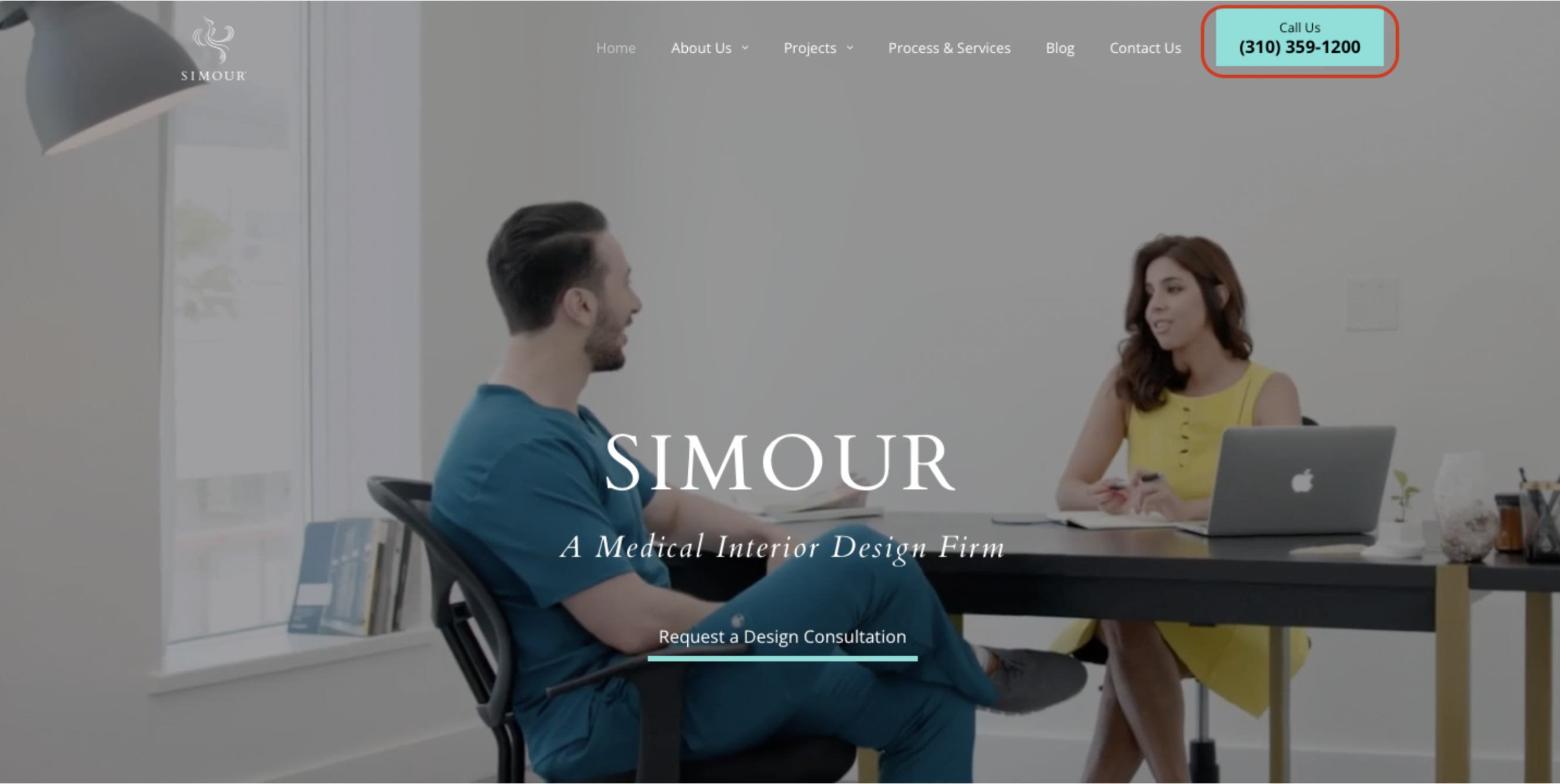
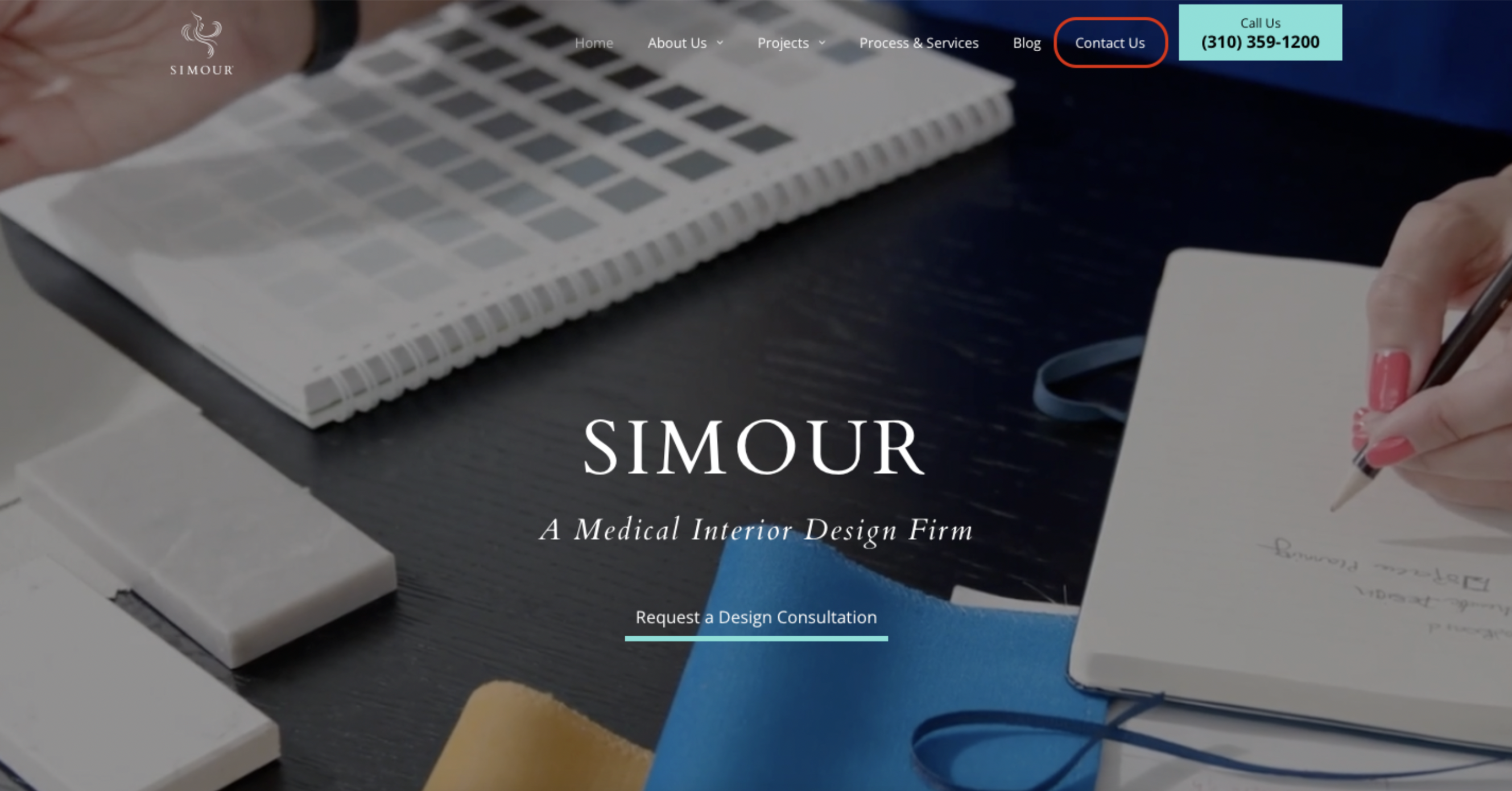
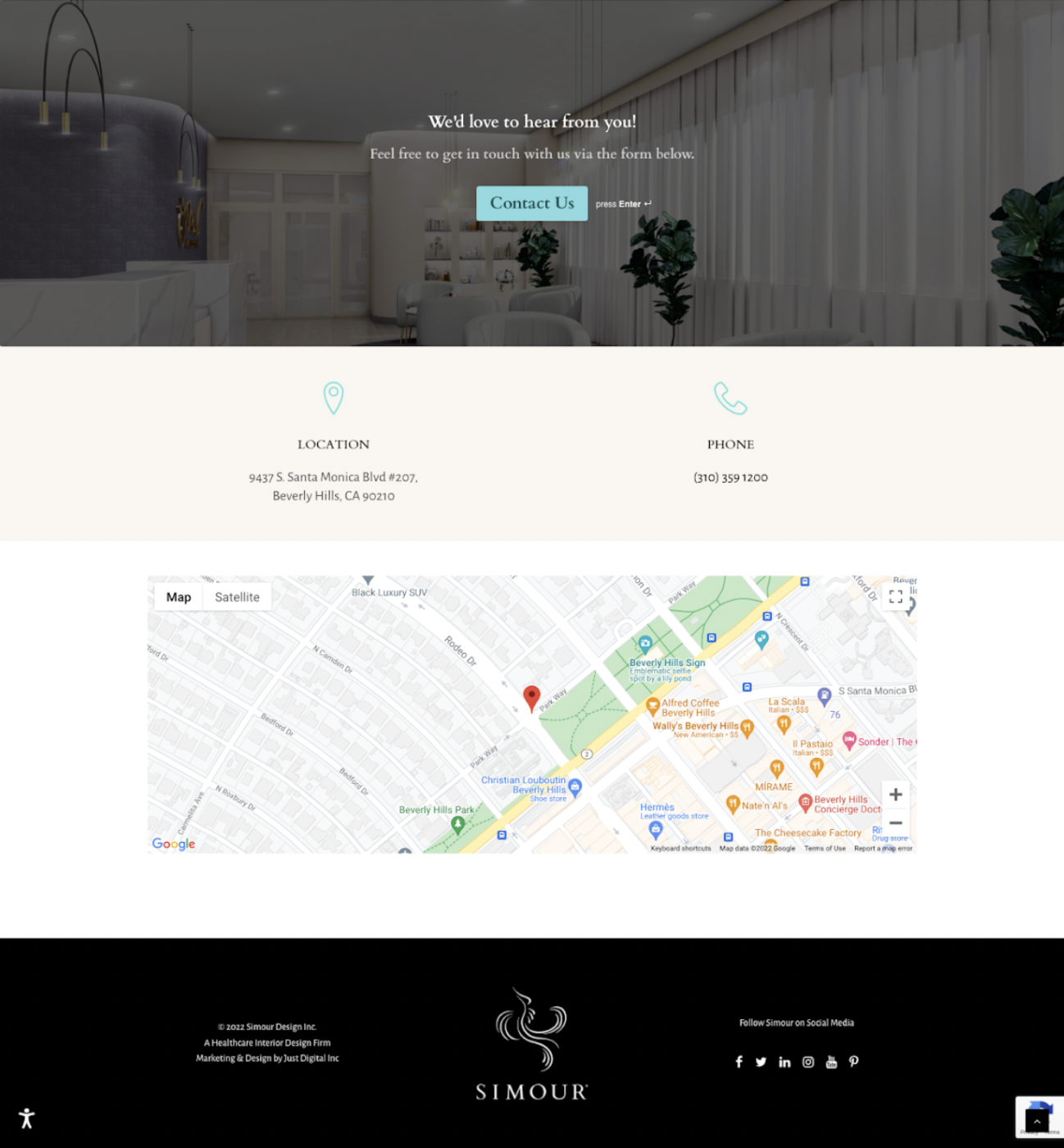
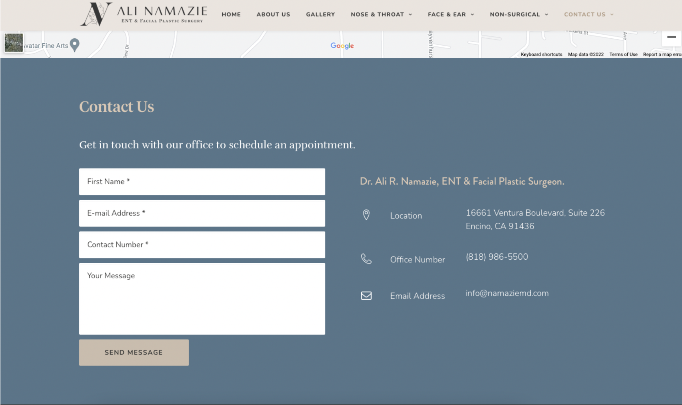
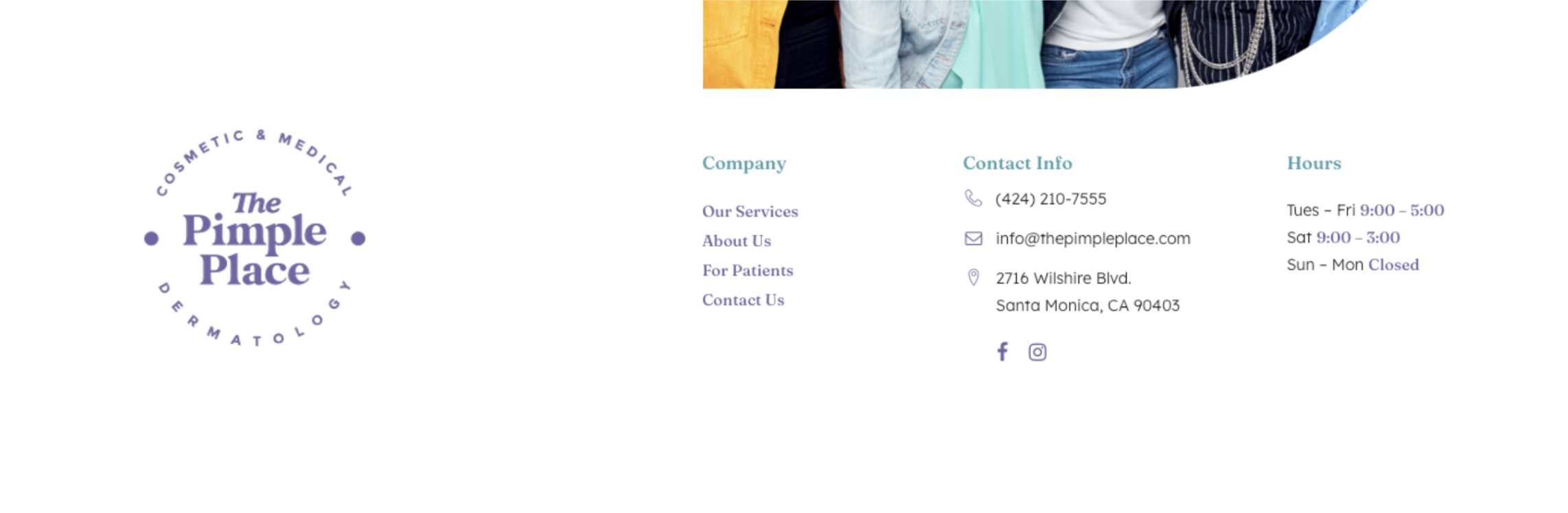
The Lack of Contact Information
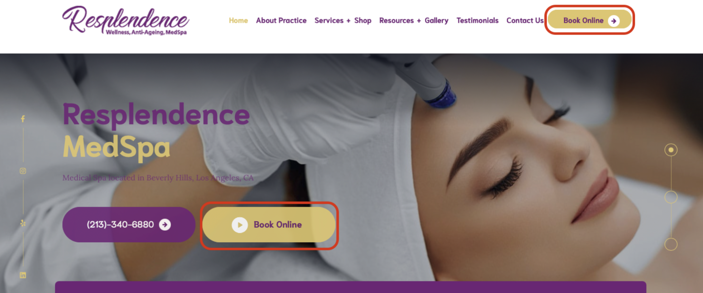
Terrible Calls To Action
Psychology Behind the CTA
Elements of an effective CTA
When There’s Too Little Or Too Much Going On
The site is giving too much
Let’s make your website the best!
With Just Digital,
Success is Easy-Peasy Lemon-Squeezy.
When life gives us lemons, we generate results. Contact us today and we can start making lemonade.