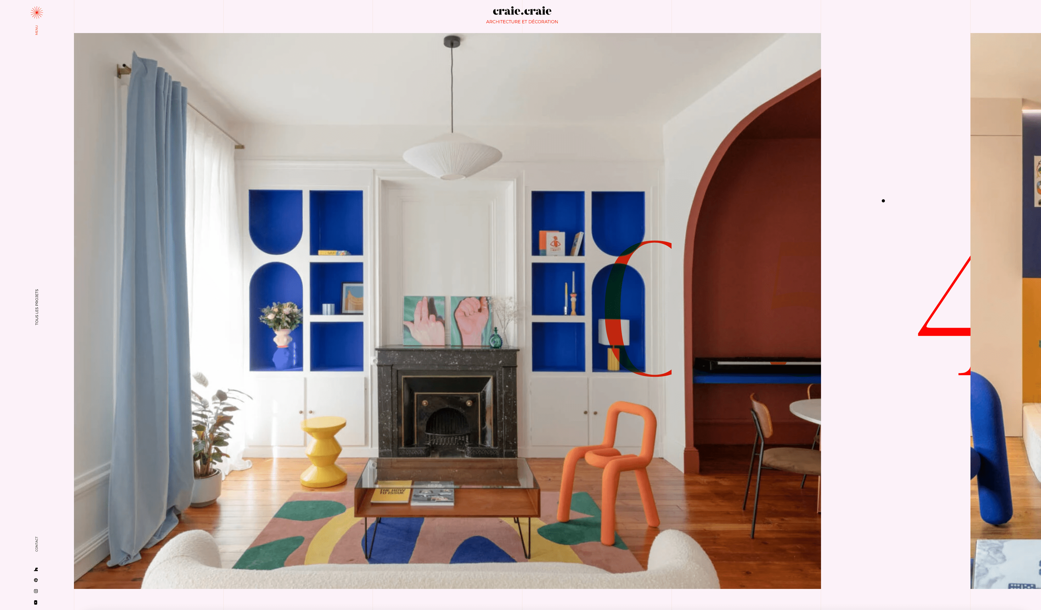
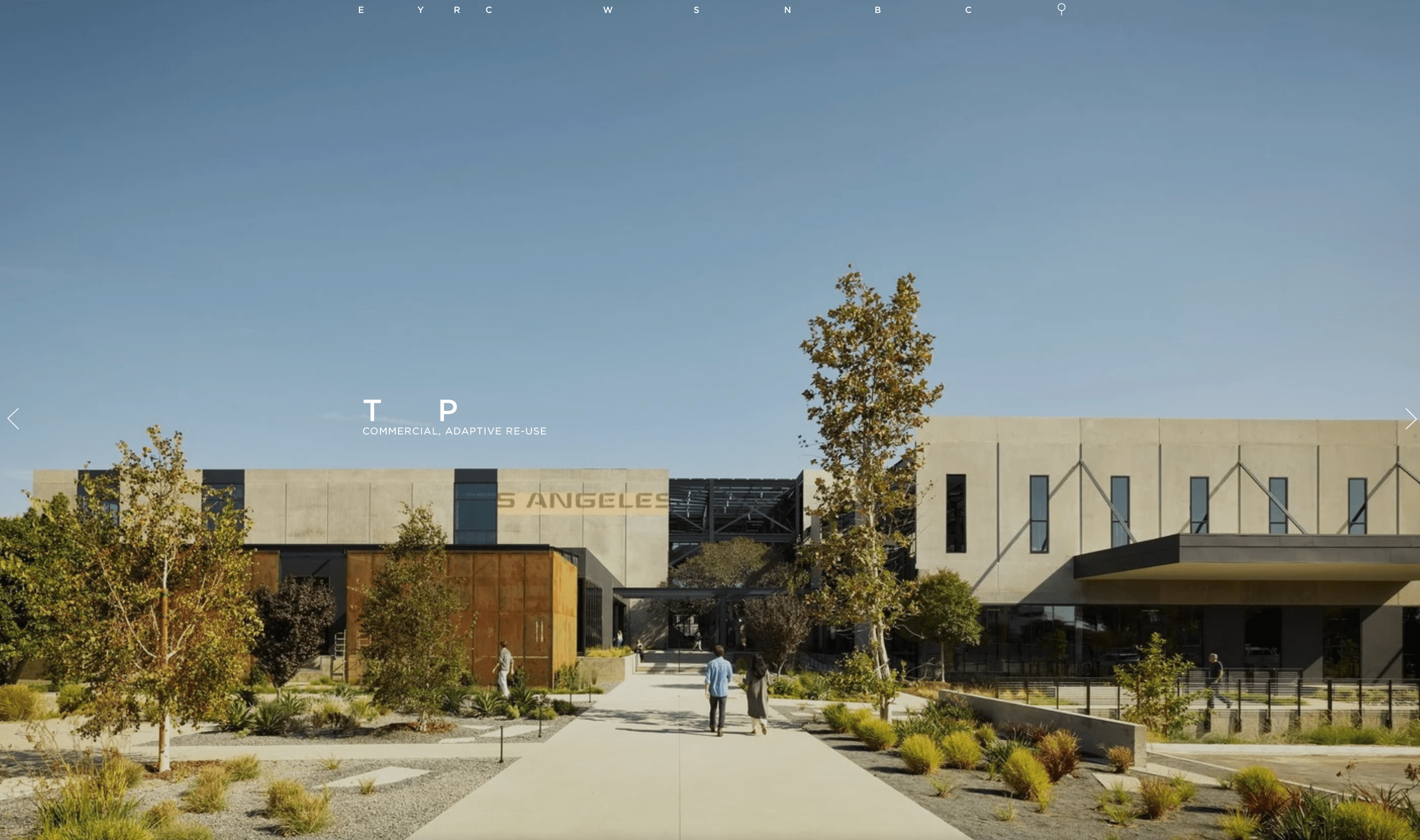
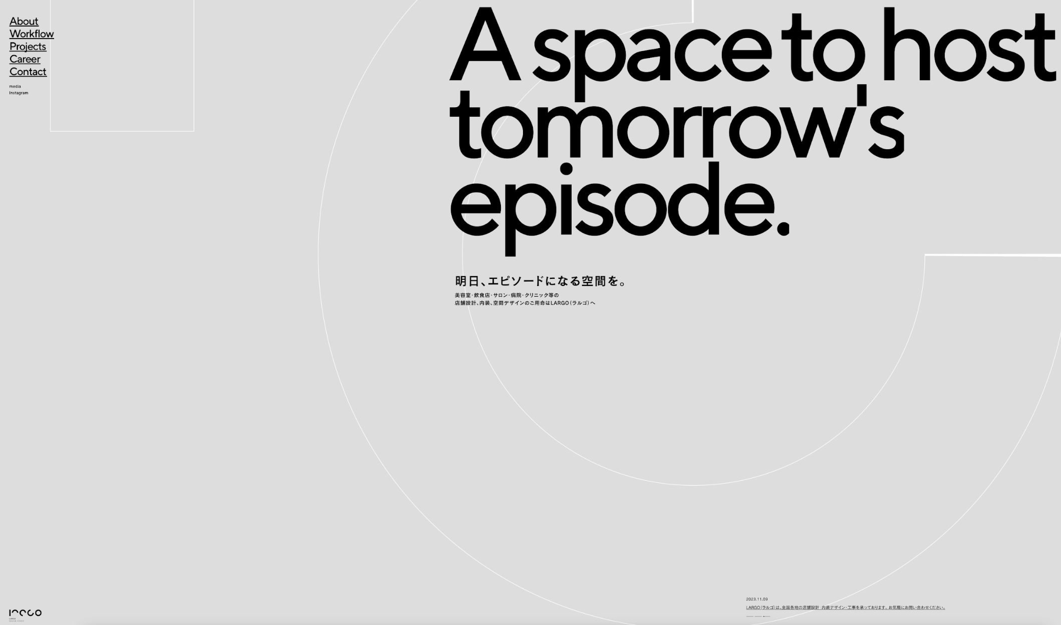
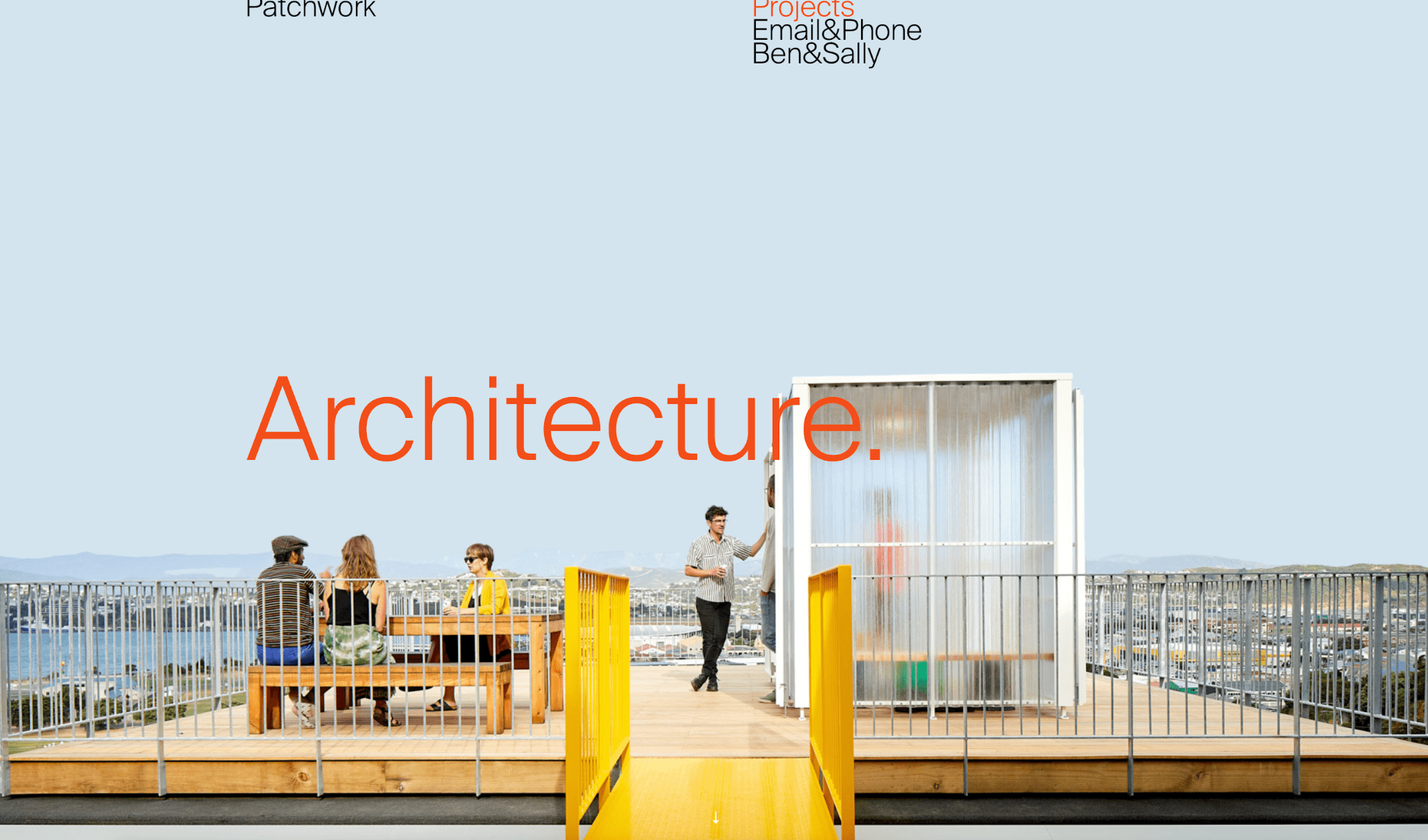
Today’s digital age demands more than just awe-inspiring structures. It calls for an online presence that’s equally captivating. Your website is not just a digital portfolio; it’s the cornerstone of your brand’s online identity. That’s where architecture website design comes into play. It’s about crafting a website that’s as meticulously designed as your architectural projects. NOTE: If you’re looking for examples of exceptional architecture website design, scroll down to the second half of this blog! Imagine a website that not only showcases your portfolio in the most visually stunning way, but also speaks volumes about who you are and whom you serve. It’s your digital business card, gallery, and first handshake with potential clients, all wrapped up in a stylish, easy-to-navigate package. But it’s not just about looking good. Functionality is key. A great architecture website balances aesthetic appeal with user-friendly design, ensuring visitors can find exactly what they need without getting lost in the blueprint. From showcasing your portfolio to providing clear contact information, every element should be strategically placed. So, are you ready to construct a website that not only attracts more eyes but also builds a stronger brand and brings in the right projects? Let’s dive into the world of architecture website design and discover how to put your firm above the competition. It’s time to turn your digital presence into your most valuable asset! In the context of architecture, a brand isn’t just a name or a logo; it’s the collective perception of your firm’s identity, ethos, and reputation. Think of it as the soul of your architectural practice, something that transcends physical structures to resonate with your audience. It’s what people whisper about you when you leave the room. A brand in architecture is the story that your buildings, your team, and your marketing materials all tell together – harmoniously and consistently. Creating your architecture firm’s brand is similar to designing a building – every aspect plays a crucial role. Here are the key components: In the digital world, your website is your firm’s virtual headquarters. It’s where first impressions are formed and can be a deal-maker or breaker. A well-designed website acts like a showcase of your firm’s philosophy, style, and achievements. It’s where your brand comes alive in pixels and code. And it’s where potential clients get a taste of what it’s like to work with you and where they begin to trust your expertise and vision. Making a memorable first impression with an architecture website design hinges on several key factors that capture and retain a visitor’s attention from the moment they land on your page. Here’s what people generally take note of: Before we break ground on the specifics, let’s remember that each component of your website, like each element of a building, plays a critical role in the overall experience. From the foundation of user experience to the finishing touches of content, each aspect combines to create a site that’s not just functional, but also a true reflection of your brand’s architectural genius. In the architecture industry, your relationship with clients doesn’t end with the completion of a project. It extends into how you present these collaborations and outcomes on your digital platform. A well-designed website can serve as a dynamic space for engaging with potential clients and showcasing the depth of your expertise. Two key elements play an important role in this: Testimonials and Case Studies, and Interactive Features. Client testimonials are more than just reviews; they are endorsements of your skills, reliability, and creativity. When potential clients visit your website, seeing positive feedback from previous clients can significantly influence their decision-making. It’s about building trust through the experiences of others. Incorporating case studies takes this a step further. These are comprehensive narratives of select projects that detail your approach from conception to completion. They should highlight challenges faced, innovative solutions provided, and the final outcome. Case studies offer a window into your problem-solving process and demonstrate your firm’s capability in handling diverse architectural needs. How to Effectively Showcase Them In an industry where visual representation is everything, using technology to create immersive experiences can set your architecture website design apart. So, there you have it. With some honest words from your clients and a few interactive goodies, your website can be more than just a portfolio; it can be a place where potential clients come to see, feel, and experience your work, and leave wanting more. Let’s make your website not just informative, but irresistibly engaging! Alright, let’s talk content. It’s not just what you say; it’s how you say it. When it comes to your website, you want content that hooks your audience and keeps them scrolling. It’s like making a good coffee – the right blend is key. Here’s How to Nail It: Now, about blogging. It’s not just an online diary. It’s a powerhouse tool for sharing your knowledge and showing you know your stuff. Why a Blog is a Game-Changer: So, there you have it. Engaging content and a kick-butt blog can do wonders for your architecture website design. It’s all about sharing what you know in a way that’s easy to digest and keeps people nodding along. Imagine you have a big sign for your architecture business. You want this sign to be seen by as many people as possible, right? SEO (Search Engine Optimization) is like your online sign. It helps people find your website when they search for things like “architecture” on the internet, especially on Google. Simple Steps to Improve Your SEO: Want to attract customers near you? Then you need local SEO. This means making sure people in your area find you first when they search for an architect. Easy Local SEO Tips: Your website and social media should be BFFs. They work better together. Integrating social media on your site can keep visitors engaged and lead them to your social channels. Social media isn’t just for sharing memes. It’s a powerful tool to drive traffic back to your website. Strategies for Social Success: There you go! With a bit of SEO magic and social media savvy, you can significantly boost your website’s visibility and attract the right crowd. In today’s world, if your website isn’t friendly to a smartphone, it’s not playing the game right. A mobile-first design means your site will look great and work smoothly on all devices, especially those that fit in our pockets. Key Mobile-Friendly Moves: Every great website has a goal: to get visitors to do something. That’s where call-to-action (CTA) elements come in. It’s about nudging visitors to take the next step, like getting in touch or booking a consultation. Making CTAs Work: Lead generation is a key part of growing your architecture business online. It’s about collecting contact information from people who visit your website so you can keep in touch and potentially turn them into clients. Simple Ways to Get More Leads: Your architecture website design should encourage visitors to engage and provide their information. By focusing on these aspects, you’ll create a website that not only draws visitors in but also encourages them to leave their contact information, increasing your chances of turning them into clients. Let’s talk about using analytics for your website. Analytics give you a bunch of useful info on how your website is doing and what your visitors are up to while they’re there. It’s super helpful for figuring out what’s working well and what might need a bit of a tune-up. How to Use This Info: KPI stands for Key Performance Indicators. Think of KPIs as the key scores that show you how well your website’s doing. It’s a scoreboard for your site. KPIs You Should Know About: Web design is always changing, and it’s good to stay ahead of the game. There are new technologies and styles popping up that can make your site stand out. Some Trends to Watch: People’s habits online change over time. Your website should adapt to keep up with what users expect and enjoy. Why We Love It: Craie Craie’s website is a masterclass in balancing creativity with simplicity. Their grid-lined homepage gives off a cool, coordinated vibe, and the big, bold text makes everything super easy to read. Plus, their fun animations make browsing the site a real treat. However, we’d recommend focusing a bit more on user friendliness – the ultra-unconventional navigation and layout could throw off some less tech-savvy website users. Get the Look: Embrace grid lines for a structured layout. Use large, bold typography for easy readability and add interactive visuals like dynamic cursors and pop-up images to make your website more engaging. The Cool Factor: EYRC Architects uses imagery and playful text to weave a unique digital story. It’s a bit mysterious, but totally captivating, showcasing their work in a way that’s both intriguing and visually stunning. Get the Look: Tell your story through powerful imagery and creative text. Use a mix of striking photos and playful language to create a unique and mysterious atmosphere on your site. Standout Elements: Largo Studio‘s website is a digital canvas of geometric graphics and animated scrolling. They make browsing feel like you’re on a journey, with videos that add a narrative touch to their design portfolio. Get the Look: Implement geometric graphics and animated scrolling for a dynamic experience. Add progressive videos to narrate your project stories and create an immersive journey for your visitors. What Sets It Apart: Patchwork‘s website uses an asymmetrical layout that’s both unconventional and intuitive. Their use of white space and hover effects makes exploring their projects feel like uncovering hidden gems. It’s a perfect blend of order and creativity. Get the Look: Adopt an asymmetrical layout with plenty of white space for a modern, clean look. Use hover effects to add an interactive layer to your portfolio presentation. The Wow Factor: Artikon’s website, designed by Page Black, is a sleek tribute to modern architecture. With its sharp lines and minimalist design, the site mirrors the company’s architectural style. The quick-loading pages and crisp typography add to the site’s professional feel. Get the Look: Opt for a minimalist design with sharp lines and bare surfaces. Utilize a black and white color palette with sans-serif typography for a professional, on-brand appearance. Why It’s Awesome: The Future of Office’s site takes you on a one-page journey with a retro vibe. The pastel color palette and large elements make for a fun, engaging user experience. Plus, the sticky call-to-action button is a smart touch. Get the Look: Go for a retro color palette with large typography. Create a one-page user journey with interactive elements like autoplay videos and a map of your premises. Impressive Features: Rise Ap.Art uses fluid, slanted lines and a striking yellow, black, and white color scheme. The site’s mix of high-res photography and brief, benefit-focused text makes exploring their housing solutions a visual feast. Get the Look: Use rounded edges and slanted lines for a unique layout. Incorporate a distinctive yellow accent against black and white backgrounds to make your content pop. What We Love: Favre+Guth’s website’s Bauhaus influence is evident in its sharp edges and blocky layout. The blue highlights and interactive mouse cursor add a playful yet sophisticated touch to the user experience. Get the Look: Design with a responsive mouse cursor that changes form when hovering over different elements. Use blue highlights on images and links, and select excellent typography that complements your overall design. Key Highlights: Empty State’s website stands out with its two-column sliding layout and attention-grabbing messaging. Their showcase of lighting solutions is detailed and creatively presented, making the site both informative and visually appealing. Get the Look: Create a two-column sliding content layout with attention-grabbing messaging. Showcase your products or projects in detail, highlighting the uniqueness of each. Simplicity Meets Elegance: Measured’s website is a testament to the power of simplicity. The asymmetrical layout, high-quality images, and sleek slider showcase their projects in a visually impactful way. The integration of a news section and newsletter subscription is a smart move for engagement. Get the Look: Embrace simplicity with an asymmetrical layout and high-quality images. Add a sleek slider to highlight projects and integrate a sticky menu for easy navigation. Captivating Design: Zikzak’s website is a visual treat, boasting a slider that highlights their stunning projects. The masonry layout for their project page is not just visually pleasing but also highly functional, making it easy for visitors to explore their work. Get the Look: Use a nice slider on your homepage to feature projects prominently. Opt for a masonry layout on your project pages to display images effectively and maintain an easily navigable menu. Why It Stands Out: Canatal‘s website is a stellar example of engineering meets digital art. They’ve managed to turn their site into a dynamic showcase of their steel structures, echoing their solution-focused and proactive approach. Integrate videos to add a dynamic feel to your site, and use a slider that’s as sleek as it is functional. Don’t shy away from hover effects that add depth to the user experience, and make sure your images are high quality to really show off your work. Canatal’s website is a masterclass in blending functionality with stunning visuals, perfect for those looking to infuse their site with a sense of innovation and precision. Get the Look: Blend impressive animations with an asymmetrical layout for a modern, eye-catching design. Employ smooth scrolling animations and ample white space to highlight your content effectively. Prioritize a clean visual hierarchy and crisp typography to keep your site both aesthetically pleasing and easily navigable. Elegance in Simplicity: Mafco House’s website is a beautiful blend of white space, compelling content, and smooth navigation. The large, quality images coupled with beautiful typography perfectly capture the firm’s modernist approach. Get the Look: Utilize white space for a sophisticated and attractive design. Focus on visual hierarchy with large, quality images and beautiful typography, complemented by a smooth slider. These websites are more than just digital spaces; they’re a showcase of creativity, innovation, and a deep understanding of what makes architecture so fascinating. Each of these sites brings something unique to the table, whether it’s through interactive elements, stunning visuals, or a seamless user experience. They prove that in the world of architecture website design, the sky’s the limit. When it comes to architecture, your website is a big deal. It’s like the front door to your business online. A well-thought-out site can really show off your work and help you connect with clients. Investing in a good online presence is super important. It’s the first step many clients take to find and learn about you, so you want to make a great impression. Keep it fresh, friendly, and functional. Just Digital is here to transform your architecture firm’s website into a stunning digital masterpiece. Our expert team is here to craft a website that not only showcases your work but also captivates your audience. From interactive designs to mobile-responsive layouts, we’re ready to bring your vision to life. 🔹 Don’t just blend in – stand out! Let’s create a website that’s as remarkable as your architectural projects. 👉 Get Started Now and take the first step towards a breathtaking online presence that reflects the essence of your brand. Your dream website is just a click away!Understanding Branding in Architecture
What Exactly is a Brand?
The Foundations of an Architectural Brand
The Role of Web Design in Branding
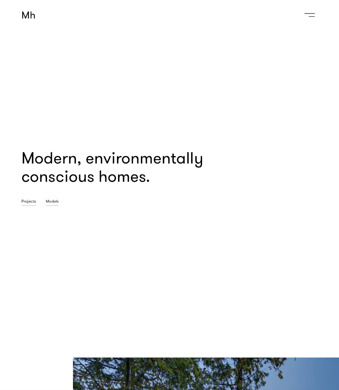
Architecture Website Design: The Digital Facade of Your Brand
Making a Memorable First Impression
Essential Components of Architecture Website Design
Client Engagement and Interaction
Testimonials and Case Studies: Showcasing Client Feedback and Project Stories
Interactive Features: Using Virtual Tours, 3D Visualizations, and Interactive Maps
Best Practices for Integrating Interactive Features
Content Strategy for Architecture Website Design
Crafting Engaging Content
Blogging and Thought Leadership
SEO: Making Your Website Easy to Find
What is SEO and Why is it Important?
SEO for Your Local Area
Leveraging Social Media through Architecture Website Design
Integrating Social Media Platforms
Using Social Media to Drive Traffic
Mobile-First Design Approach
Conversion Optimization in Architecture Website Design
Call-to-Action Elements
Lead Generation: Turning Website Visitors into Potential Clients
Improving Your Website for Lead Generation
Analytics and Performance Tracking
Using Analytics to Improve Architecture Website Design
Key Performance Indicators (KPIs) for Architect Websites
Future Trends in Architecture Website Design
Emerging Technologies and Design Trends
Adapting to Changing User Behaviors
Our Top 13 Favorite Architecture Website Designs
1. Craie Craie by Studio Beaucoup
2. EYRC Architects
3. Largo Studio
4. Patchwork Architecture
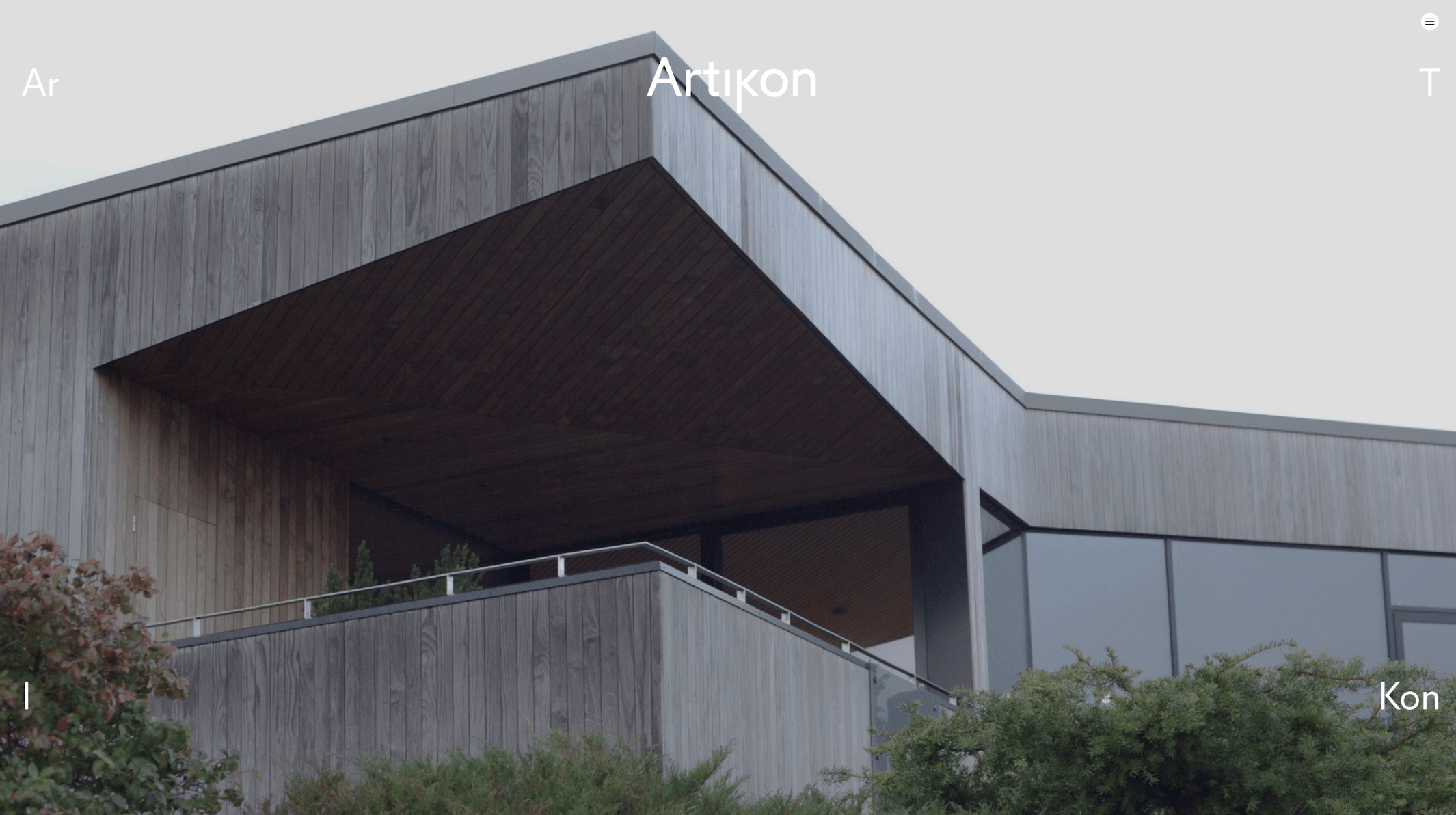
5. Artikon by Page Black
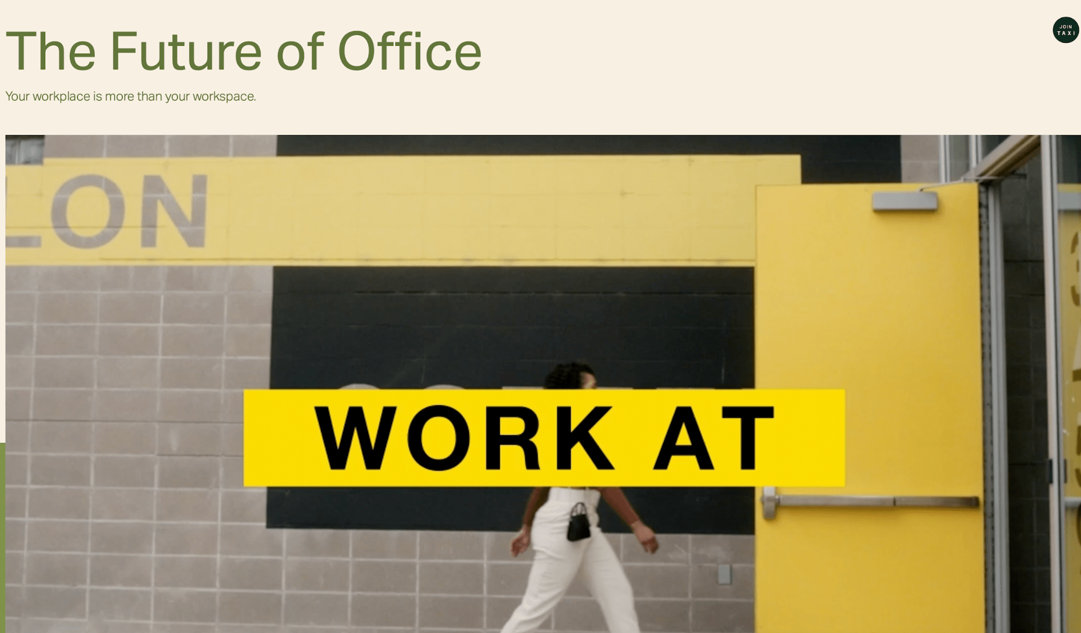
6. The Future of Office by Wunder Werkz
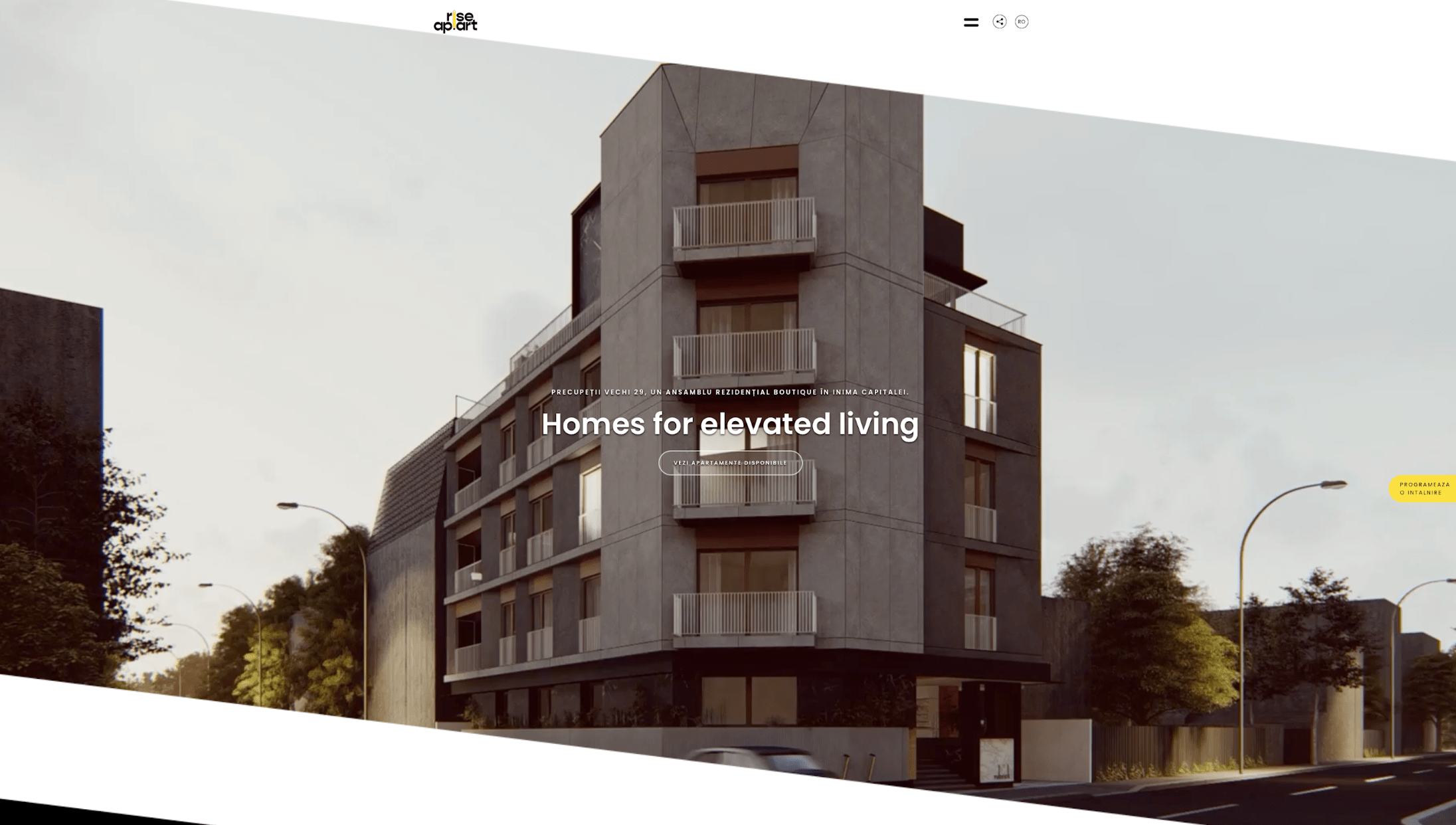
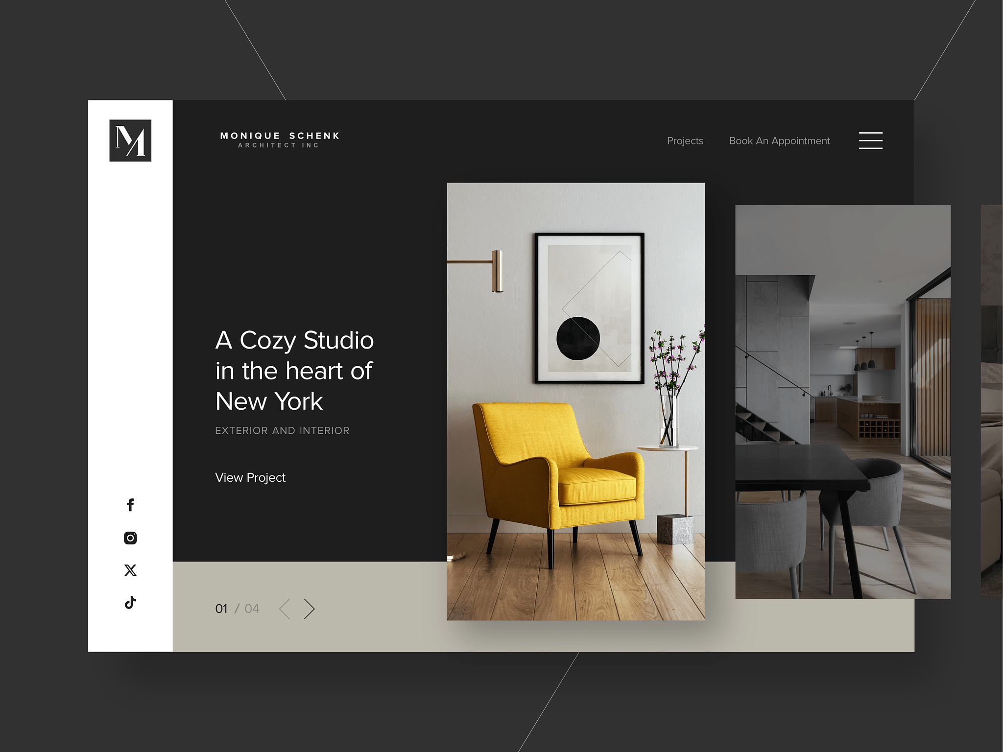
7. Rise Ap.Art by Romb Studio
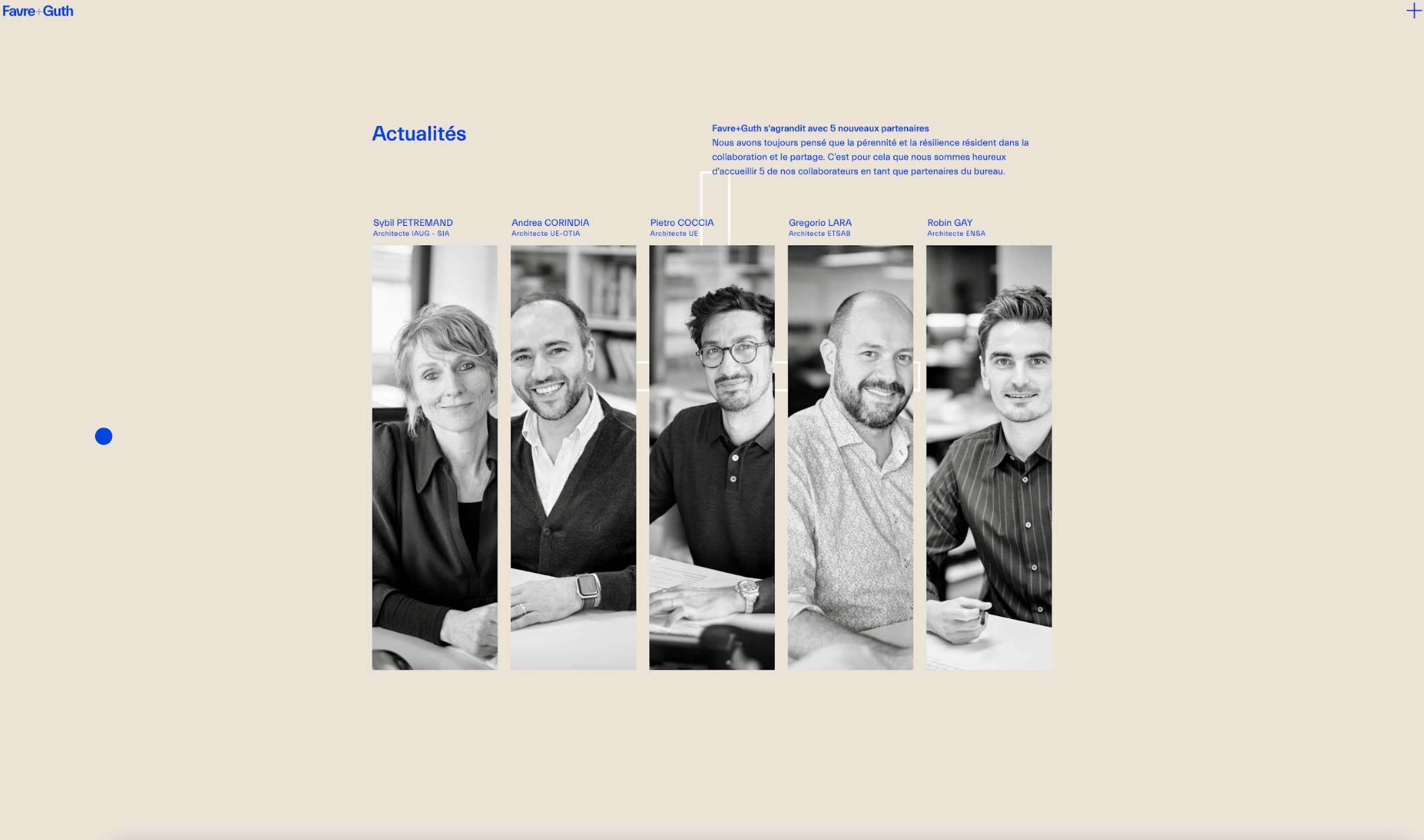
8. Favre+Guth by TWKS
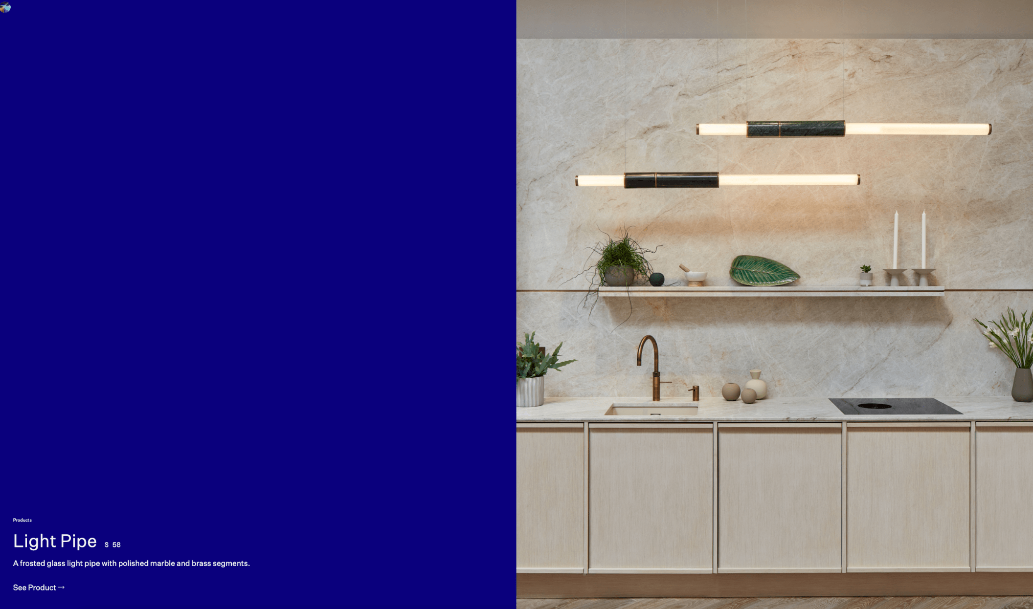
9. Empty State By Forty Eight Point One
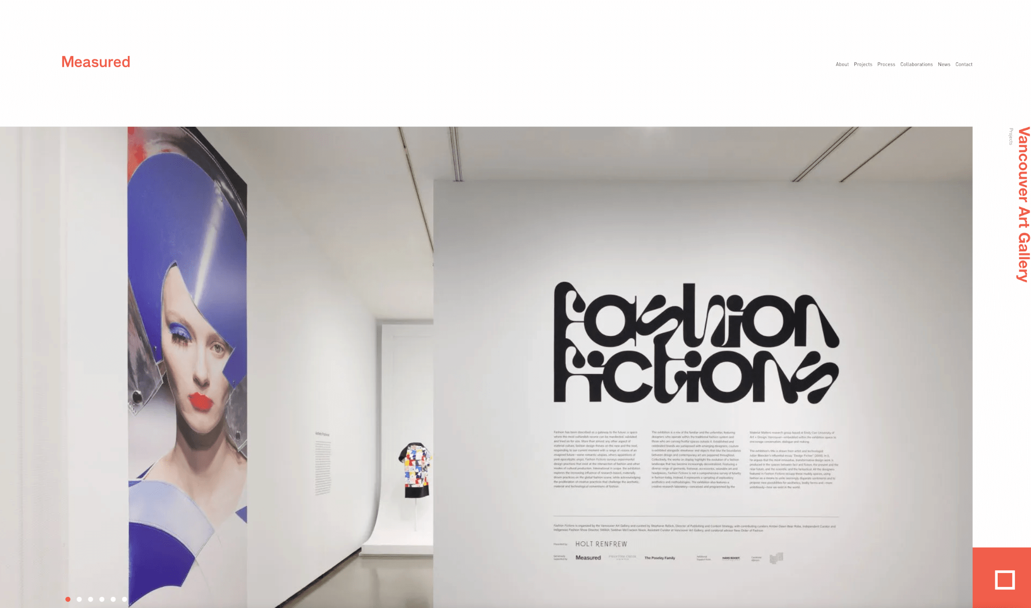
10. Measured
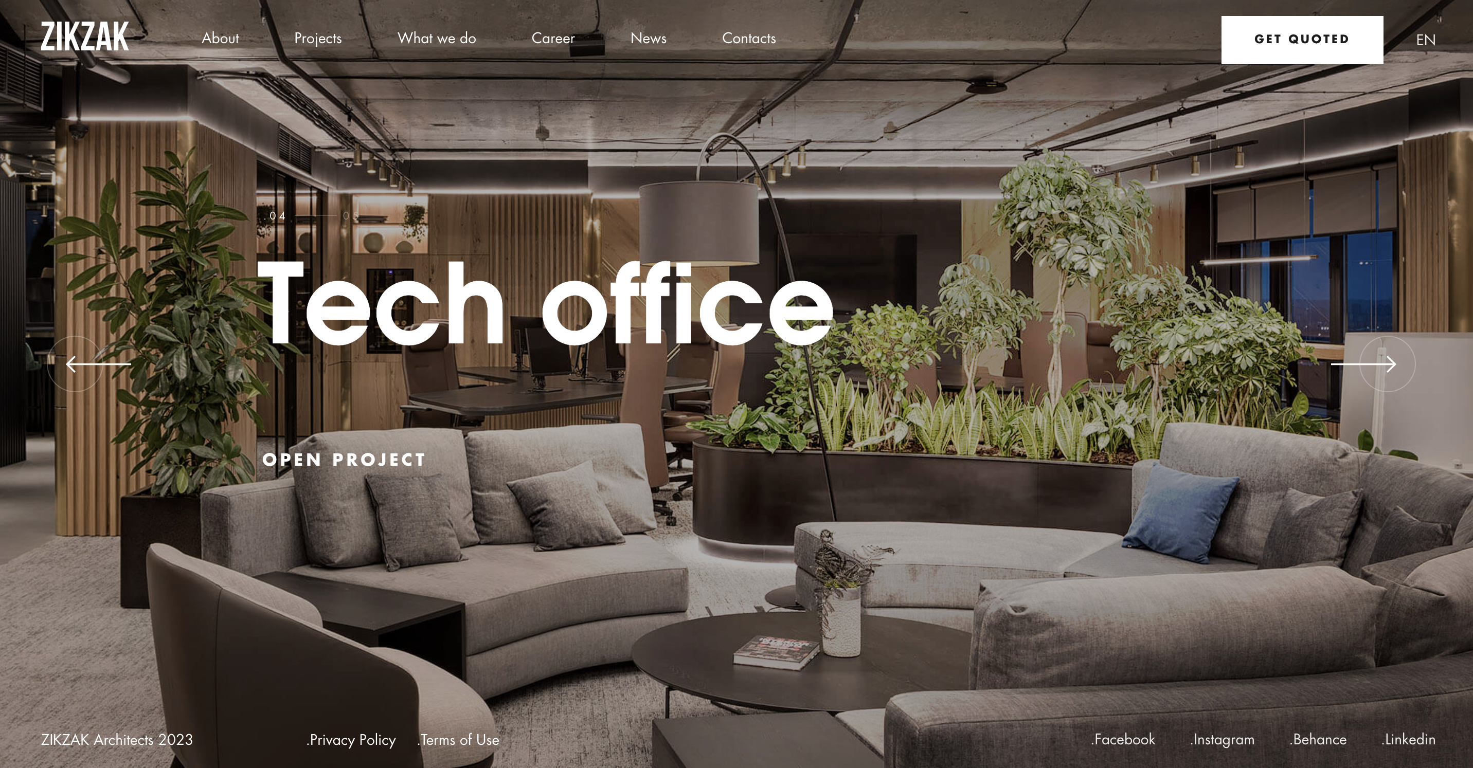
11. Zikzak
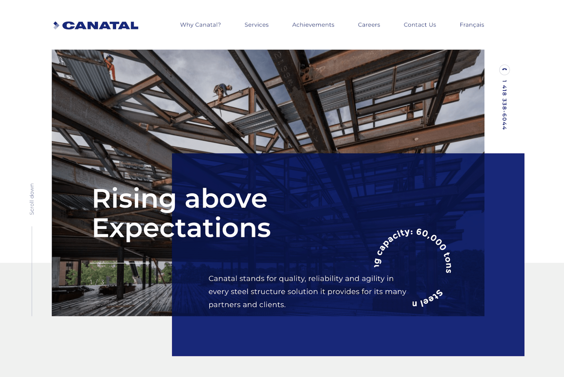
12. Canatal
13. Mafco House
Transform Your Architecture Website Design into a Client Magnet!
Ready to Elevate Your Online Presence?
With Just Digital,
Success is Easy-Peasy Lemon-Squeezy.
When life gives us lemons, we generate results. Contact us today and we can start making lemonade.