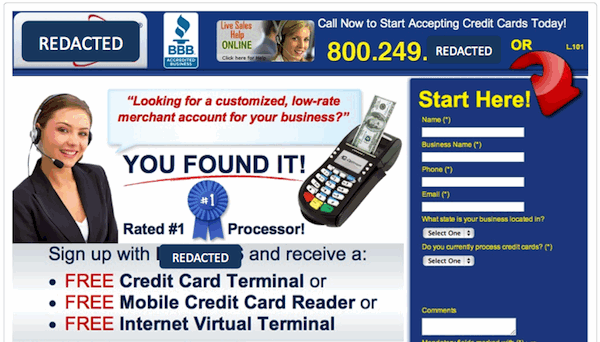
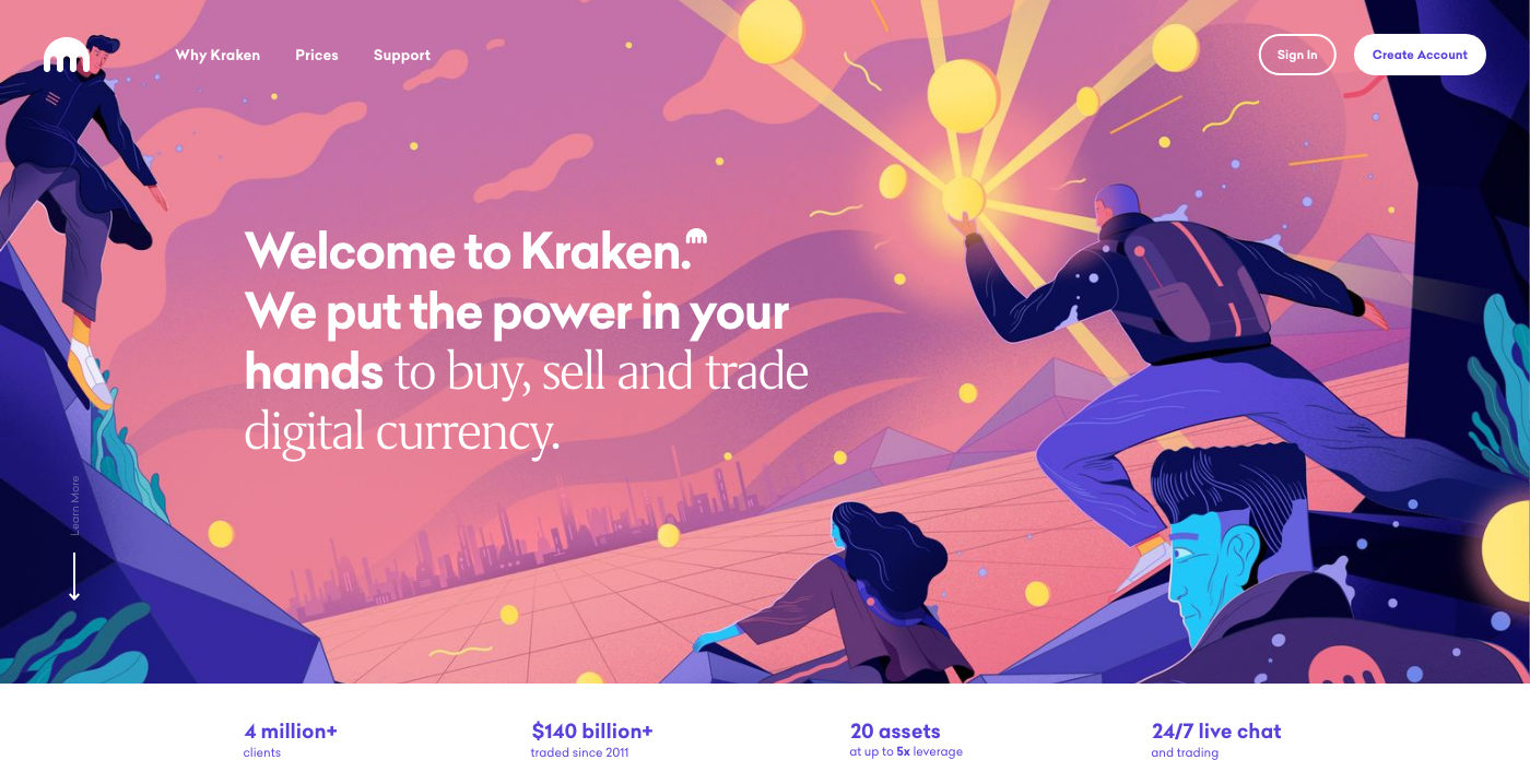
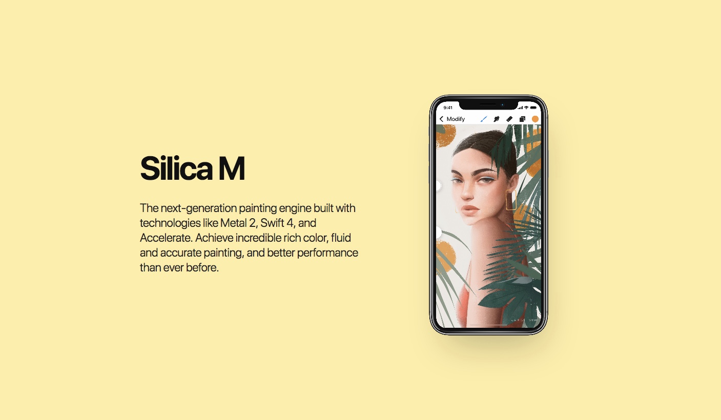
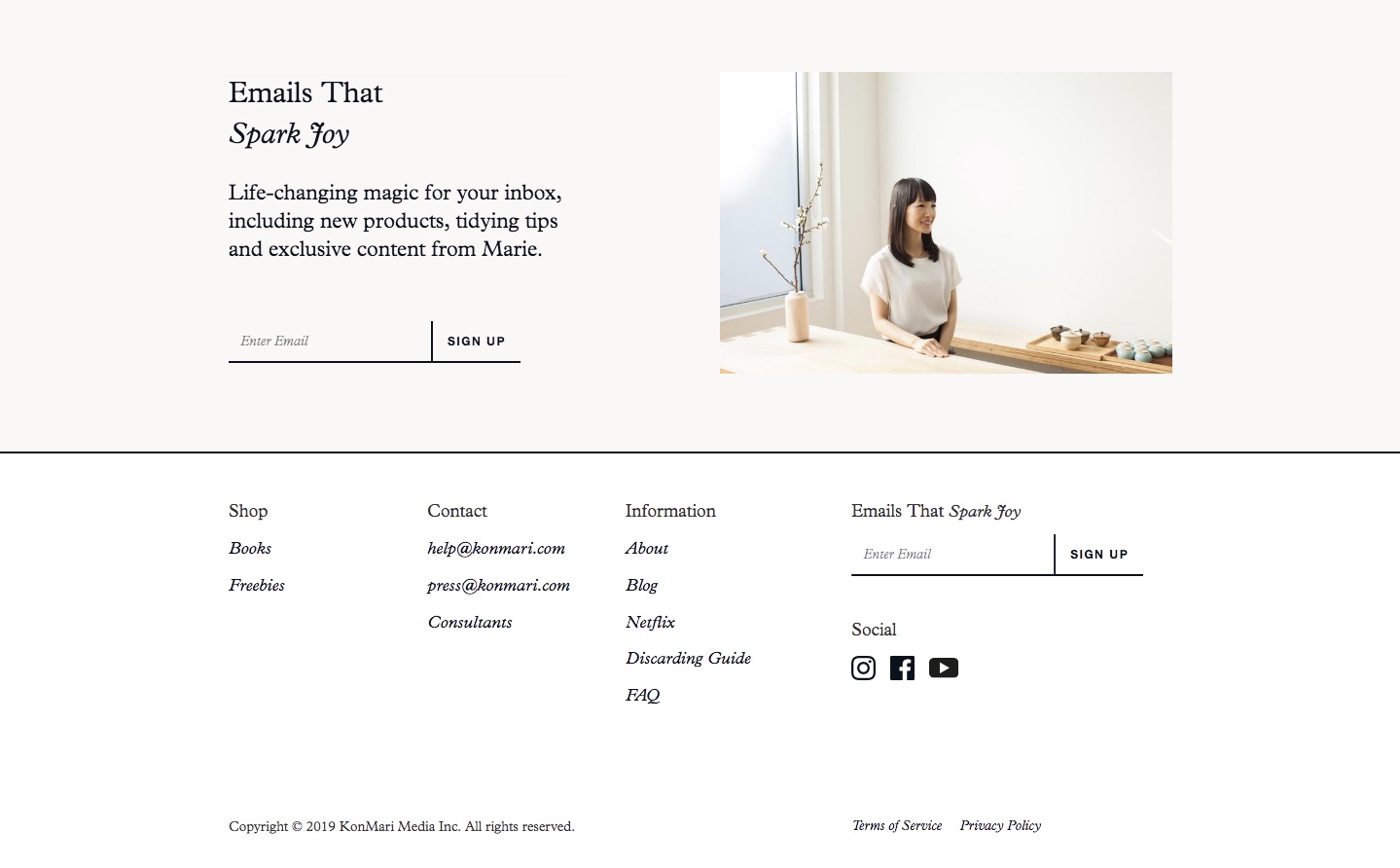
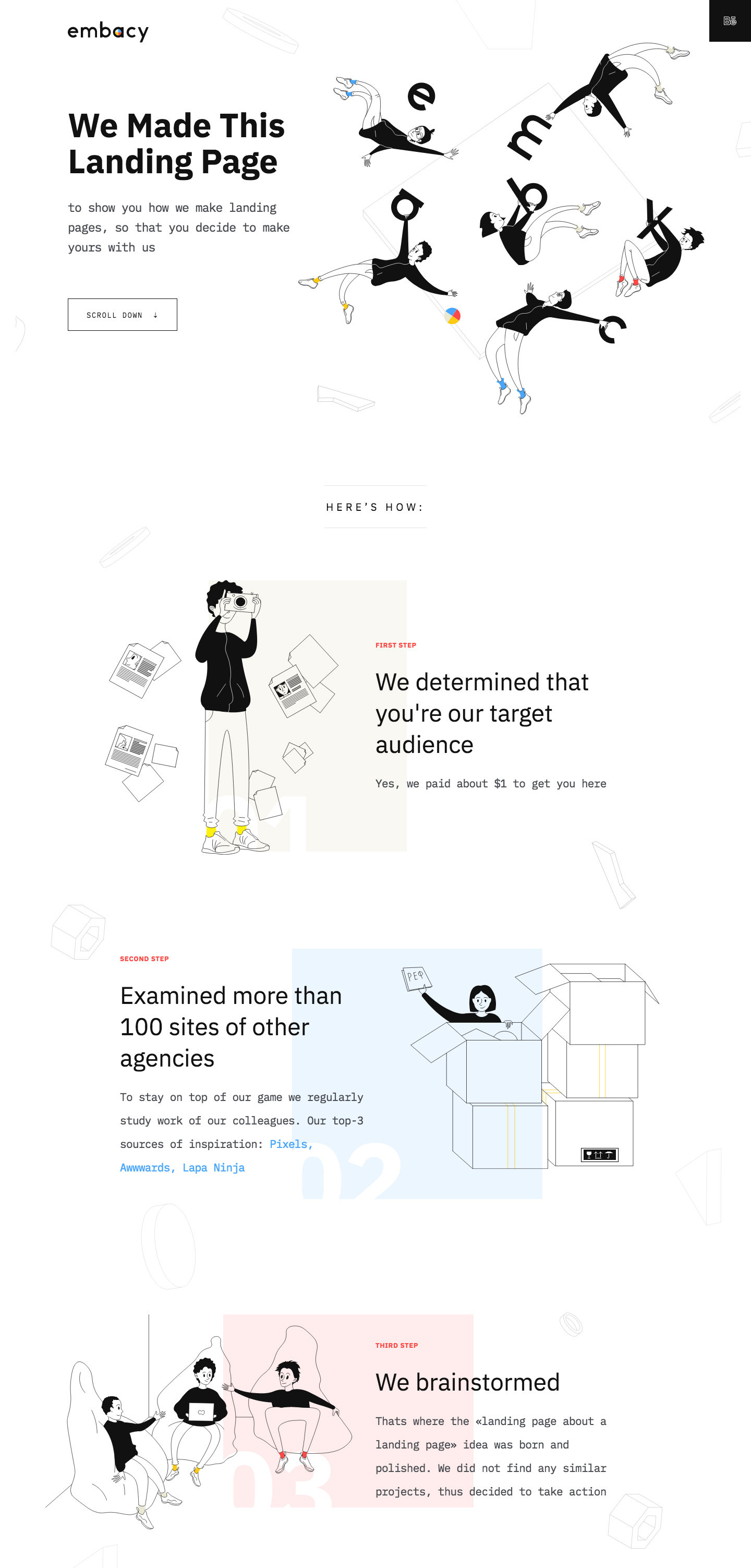
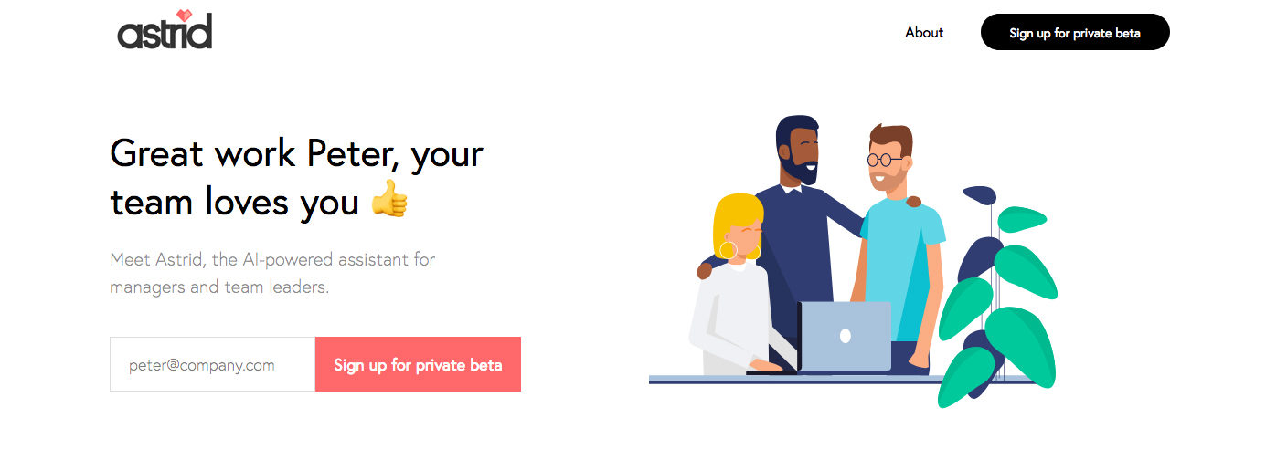
According to a study by Nielsen Norman Group, users pay close attention to photos and other images that contain relevant information. On the other hand, some types of visuals are completely ignored – “feel good” images that are purely decorative, as well as stock photos. This study (and others) prove the importance of visuals on a landing page. When people see the visuals you use, they immediately get a sense of what your brand is about. Visuals are like your brand’s sense of style. They’re a reflection of your company and the brand itself. Visuals are also proven to subconsciously indicate potential leads to act. Your style of visuals will depend on the kind of results you want. Here are 6 tips to help you improve your visual tactics. Hard selling through visuals can sometimes be too much. It can be a bit cheesy and sales pitch-y. Sometimes being subtle is the best way to go; you don’t always have to be in someone’s face to convert leads. Take this ad for example: Compared to this one: Look at both images and how they created their headlines. The top photo makes you want to close the tab as quickly as you can, while the bottom one is way more enticing. The background image is creative and grabs your attention. This mixed with the subtle headline is much more pleasing than being bombarded with hard selling text. You will also notice the text at the bottom of the advert is not as intimidating and a much more pleasant way to consume information about the company. It’s essential that you keep your brand’s landing page relevant to the services you offer. Invest the time and effort in creative and original visuals and you will produce better results. Venngage did some research regarding Facebook ads and what they found was the second-best performing ads are the ones that mix tangible and intangible objects. Ads with physical representation are shown to convert more leads. For example: This landing page is for a graphic design app. The landing page features photos of phones with graphics that you can produce by using their app. Through these photos, leads are able to visualize what they can create when using the app. Any form of object that represents your services and what you can provide to your audience is far better than nothing. People are able to visualize what you can offer, and it also makes for a better landing page. A great way to add relevant visuals to your page as well as break up the text is by utilizing icons. Icons can help lessen the text you use by offering their own kind of explanation, plus they make your page more pleasing to the eye. You can also use icons to reinforce meaning. Take a look at the photo below. This company helps build teams of engineers for people in search of their services. Observe how they use graphic icons to represent various professionals. It makes the page more interesting to look at, and it’s cleaner compared to large chunks of text. With the icons above, you have a general idea of the kind of service each professional can offer. It’s no longer surprising to hear that more than half of the universe is on at least one form of social media. It’s how people communicate nowadays. A lot of people go on social media not just to socialize, but to research and learn about various companies. This is another reason why landing pages feature links that direct people to company social media accounts. It gives people the chance to interact with the brand and have actual engagement. It helps build the trust and credibility of a company. Another positive to being active on these social media platforms is the amount of people you reach. In the photo above you can see Marie Kondo’s landing page. At the very bottom of her landing page are the logos of different social media platforms. Each of these logos is a link that directs to one of her accounts, making it easier for people to find her on their social platforms. It is now essential to use original and unique illustrations on your landing page. Graphic landing pages keep the site interesting and engage your visitors. The latest trend is that businesses intertwine stories with creative illustrations. Take a look at the example below. Notice how they use illustrations to convey the process of their services? They tell a story to captivate their audience with illustrations that help viewers understand what happens throughout each step of their workflow. Research shows that CTA buttons designed in contrasting colors to the page can generate more leads. This tends to grab the viewer’s attention and immediately directs the viewer’s eye to it. Take a look at astrid’s landing page. Observe how their ‘Sign up for private beta’ button is the first thing your eye notices – it’s because of the contrasting colors. However, be sure to choose a contrasting color that still fits well with your color scheme. People are less likely to click if the button is an eyesore. The landing page is the first thing people see when they open your website. Think of it as your only chance at making a good impression. Use visuals to your advantage and let them serve a purpose. It’s all about strategy and how you integrate captivating visuals for both the aesthetic appeal and functionality. Use it to better your business, and your brand. 1. The Art of Subtlety
2. Mix Tangible with the Intangible
3. Icons for Text

4. Social Media Links
5. Tell Visual Stories
6. CTAs That Grab Attention
Use Visuals to Your Advantage
Read Also:
With Just Digital,
Success is Easy-Peasy Lemon-Squeezy.
When life gives us lemons, we generate results. Contact us today and we can start making lemonade.

