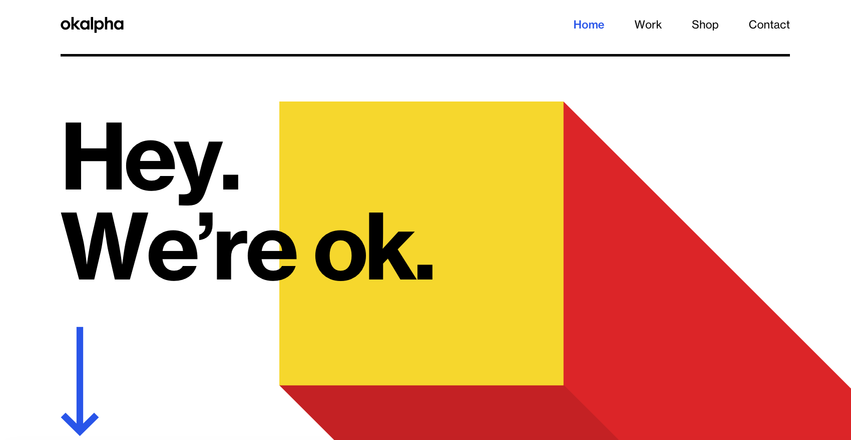
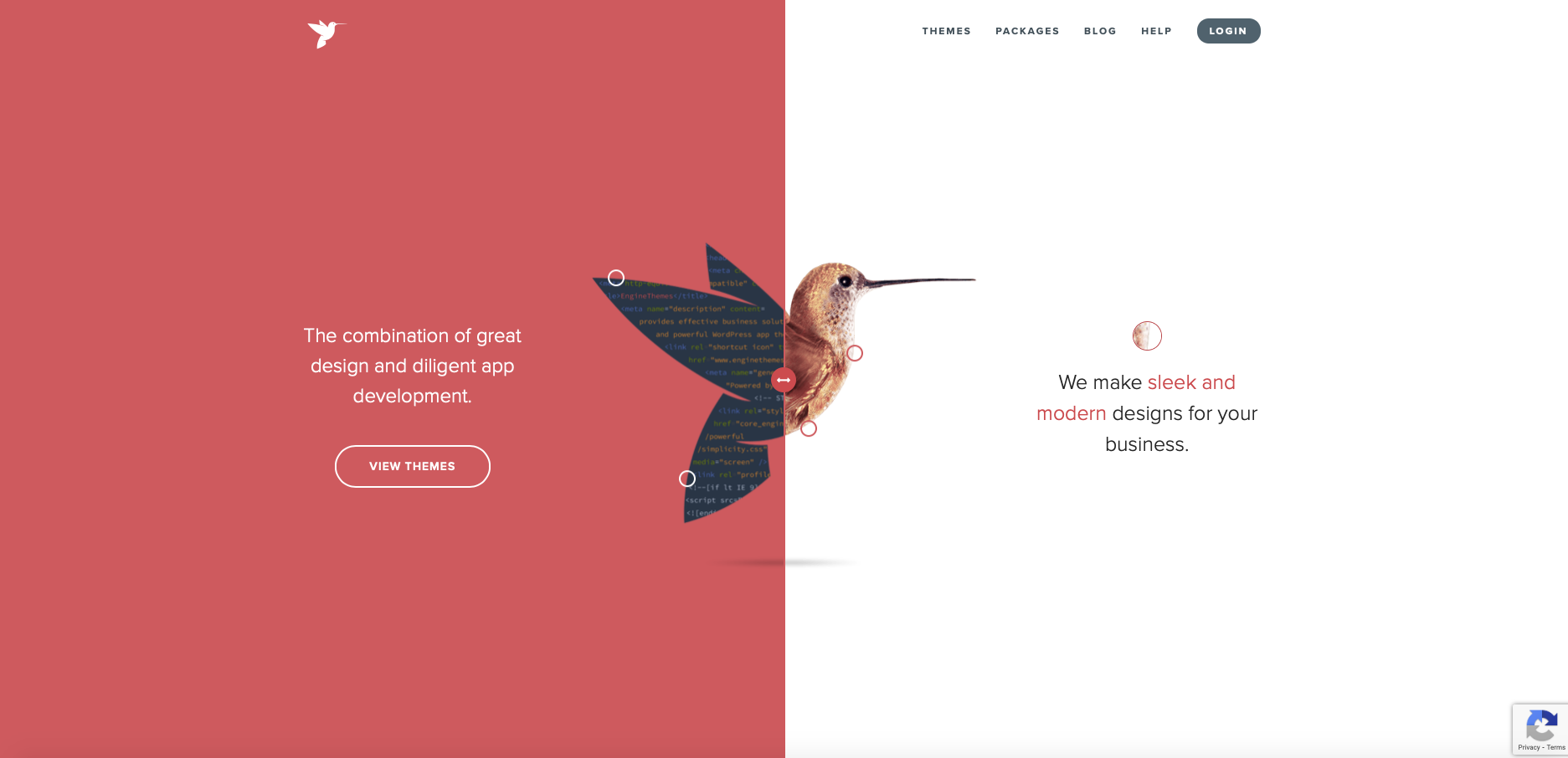
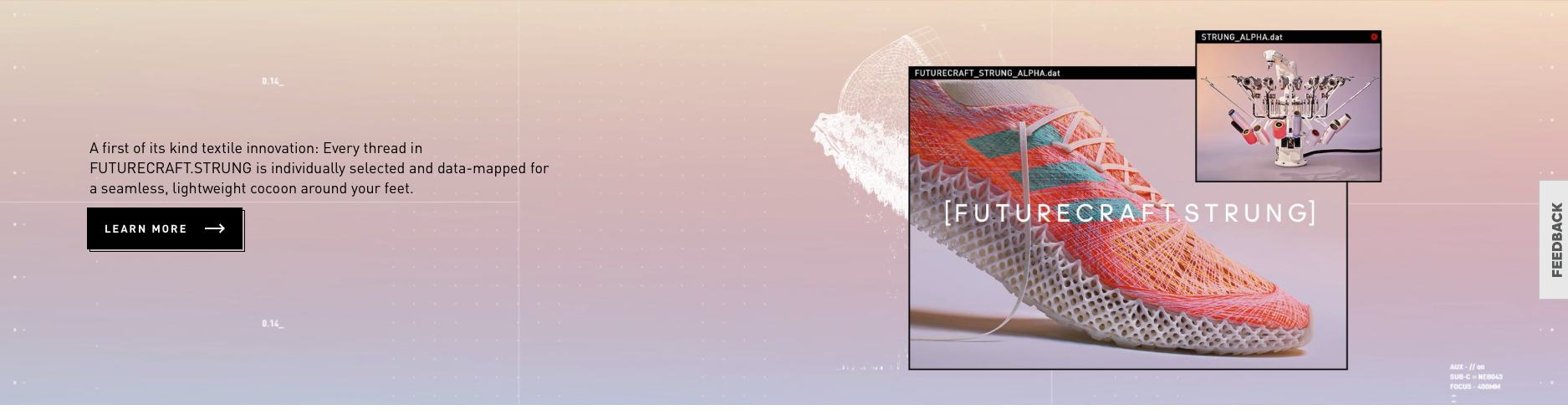
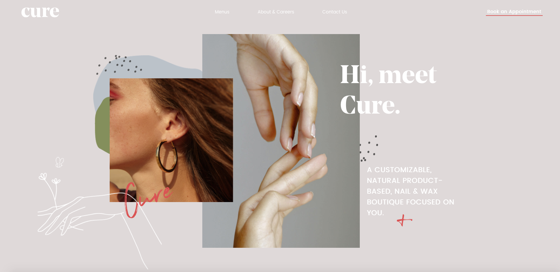
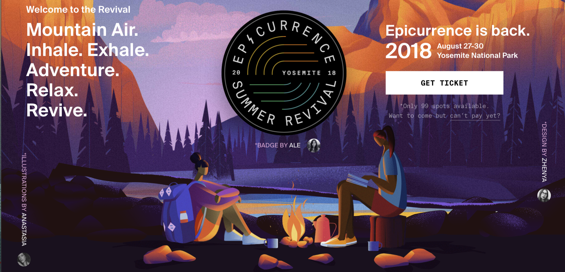
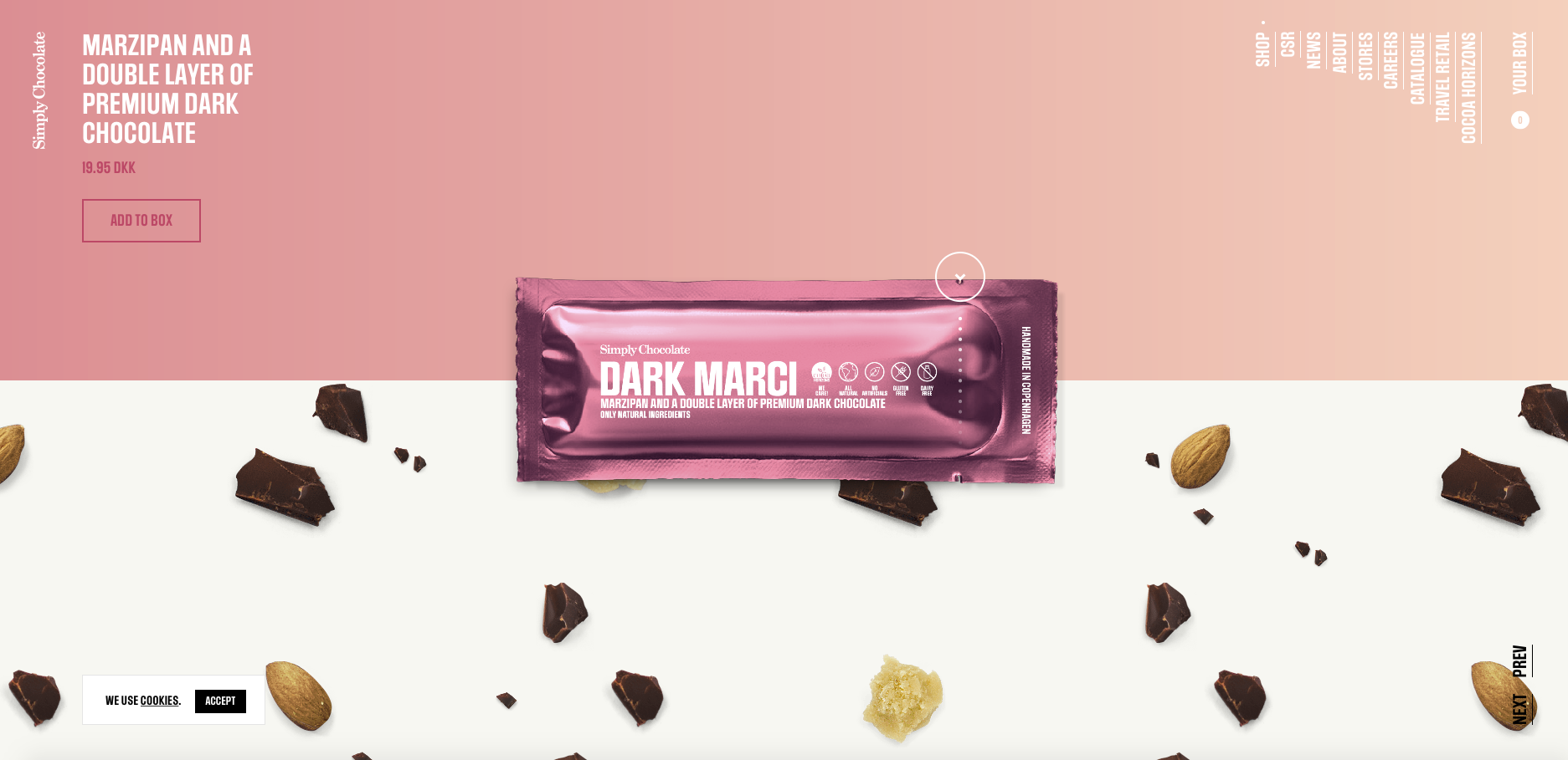
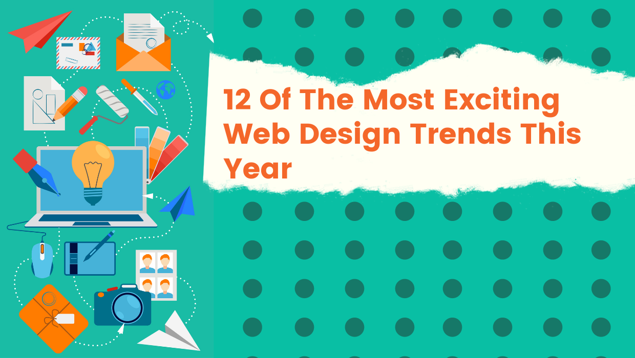
Web design is an ever-changing, ever-evolving industry. Because of this, web designers are often faced with an irony : The first being consistency, and the second being change. Design is an industry that constantly craves and fights for our attention. Each piece of design is competing to get their very own spotlight. The problem is, the design niche has become an environment flooded with stimuli and information. It becomes overwhelming for users and harder for designers to consistently deliver a clear message. The funny thing is that the design industry constantly experiences change. Web design continues to gradually change everyday. It may not be noticeable right away, but look back and see how much of it has changed. Change is constant and inexorable. There’s always something new to learn and adapt to. Technology has opened the doors for endless design possibilities. Designers now are experimenting with new technology, incorporating and reinventing previous design trends, and creating new techniques to improve their craft. Some web design trends are ephemeral while there are some staples like minimalism and flat illustrations that are still being integrated with more advanced approaches. There are some web designers that fail to consistently sharpen and hone their skills to adapt to all of the changes – and these designers are quickly left behind. To help designers better grasp the concept of consistency and change, we’ve made a list of the top 12 web design trends that strike a balance between clear content with clean, uncluttered, and rich visuals. The purpose of having a website is to effectively communicate your brand’s message right? And what better way to do it than to guide your website visitor’s eye directly to it. This year, enlarged elements are taking over the design scene. Many websites are favoring large prominent elements like big bold typography, large scale full screen images/videos, and sizable navigation icons. Having such huge elements will catch the user’s attention and guide their eye directly to your message. This trend should be used to highlight what you want your website visitors to focus on and help them understand what your website is all about. Enlarged elements make the design feel more modern without looking tacky. The best way to integrate this design is by reducing the design elements to keep your enlarged element the focal point. Don’t overdo it, adding more elements will be overwhelming and counterproductive. Give your website visitors a space where their eyes can rest. Remember, whitespace is still your best friend. Okalpha rides along with this trend by using big bold typography to introduce their brand. Their layout delivers their message efficiently by highlighting their message. The bold font catches the user’s attention, and helps them register the message, and resonate with it. There are brands that have more than one idea they’d like to convey, some are able to communicate their message without making their website look cluttered, while others.. Not so much. If you’re one of those brands that would like to convey more than one idea but still want the site to look uncluttered, try splitting your screen. Doing this will allow you to properly communicate your ideas and give both a chance to shine. Possibilities are endless with this trend, it’s captivating and engaging enough to capture your audience’s attention. You can have each side behave differently, one can be a photo and the other a video. You can also play around with scroll effects and have each side move at a different pace. Engine Themes made use of the split screen by allowing the user to drag one side to the other. The purpose was to show their audience the before and after of a coded app design and what it would look like after. You can see how they injected a visual hierarchy into the design by placing that additional element at the center where the two halves meet. It balances the screen and acts as a focal point to show you how you can drag the button. 3D has always been engaging and eye catching. It’s not something you see everyday, unless you watch a 3D movie. It’s been around for quite some time now, but not a lot have integrated 3D into their design, mainly because of the lack of technology and the hefty price. However, the constant evolution of technology has thankfully given more and more opportunities for designers to design in 3D without needing top grade tech. VR is becoming more and more mainstream, cost-effective, and hyper-realistic. This trend allows you to visually break boundaries between digital space and reality. You get to give your users a more immersive and engaging user experience. It’s interactive and fun enough to make users want to stay and explore your website longer. The only problem you’ll be facing is the speed of your website. Heavy graphics can slow down your website and might put users off. 3D is cool and it’s easy to get carried away by adding more and more visuals. Try to find a balance between both to not overwhelm your website visitors and to have your site respond faster. If 3D design isn’t your style, you can still add depth to your 2D website design by layering up elements within your web pages. This can be achieved by adding elements on top of each other. You can either place one on top, make the one behind partially obscured, or you can have additional content pop into view once a user hovers over an image. Be careful though, piling layers can make your design look more cluttered, but once done well, the composition will look legible and engaging. The trick is to use whitespace around the elements and to add hierarchy for more depth. Make one element bigger and more prominent or highlight the element by changing the color once hovered on. In the example above, Adidas layered a photo on top of typography that moves in the background. If a user hovers on the text, it changes color and is brought in front of the photo instead. It highlights their product and their message at the same time. You can try this by adding lightboxes or a parallax scrolling effect. You can also try layering images or text on top of one another. People’s attention spans are growing shorter each year. It’s getting harder and harder for marketers and web designers to impress their audience. However, one persistent way to impress is through videos and animation. It somehow always instinctively attracts the eye to that particular element. There are various methods you can incorporate motion in your design. It can be through microinteractions, or big scale moving objects. It’s engaging and pleasing to the user’s eye. It enhances the user experience and an overall creative way to deliver your brand’s message. Try to use motion only on the areas of your design you’d like your users to focus on. As fun as having animation in your web design is, it can end up being more of a distraction. If you include motion in your web design, there should be a purpose. Use it sparingly and strategically, make sure it contributes to the story you’re telling through your design. Every element you add in your design serves a purpose. Gone are the days of including images, videos, and illustrations for aesthetic purposes. Design is now more intentional than ever, the use of imagery and visuals are pieces to complete the whole. Each one supports and solidifies the brand’s message and its identity. The right use of these elements, like icons and illustrations can make a big impact in your design. It all depends on using the right illustrations and how strategic you are with your placements. It’s better to have your icons and illustrations custom made for your brand to create a coherent visual language that will encapsulate your business’ message. Dark mode has recently become a hot topic in the web design scene. It helps make a website look more sleek, sophisticated, and modern. It’s easy on the eyes and it emphasizes the colors and design elements of any web page. Visual appeal isn’t the only upside to this design trend, it also has its practical use. Dark mode is better for OLED screens because it conserves mobile phone and tablet energy and extends screen lifespans by asking its screen pixels to fire less brightly. It also reduces eye strain for users who spend hours looking at screens. Many websites and softwares are now coming out with dark mode options for users who would prefer the practicality and aesthetic appeal of this trend. Flat design is no longer a thing. This year’s web design trend is all about creating depth. You can add this trend to your design by using soft shadows and adding floating elements to create more depth and to add interest to your web page. An opposite to the more traditional flat design, try adding soft drop shadows to your images and graphics or try layering elements on top of each other. This will make your design feel more lightweight and dynamic. If you want a design with a more memorable and striking visual appeal, try overlapping graphics on top of high-quality photos or vice versa. The trend is all about letting your creativity go wild. It’s a flexible trend that allows you to use it to add extra pizzazz to your web design, or to use it to strategically contribute to your brand’s story. This trend will be most effective if everything is coherent with your brand’s identity. Pantone’s color of the year has no say with web design’s fluorescent and luminous colour scheme trend. This bold, courageous, and attention grabbing color scheme will make designs stand out. The glow-in-the-dark saturated colors will highlight any element you’d want your users to focus on. Duotones are at the forefront of this design trend. It’s all about keeping the design look futuristic by incorporating neon colors with its counterparts to make websites more effervescent. In most cases, simple is in fact better. This especially goes for website navigation. Extremely minimalistic navigation is the new trend. In order to better the user experience, the trend is taking away all the frills and complications of a website’s navigation. The user should spend more time immersed in the web page than having to think about how they can navigate through the site. Large scale photos/videos and minimum text can make up most of your website, and that should be enough to impress your users. The large elements of your page should be on the foreground and be the main focus of the design. Only use photos that are relevant and worthy to be the main attraction of your site. The image needs to have a crafty and powerful punch to your visuals. Microinteractions or UI animation is a tiny design element that plays a significant role in adding to user experience. It adds a more ‘human’ feeling to websites that will impress users. These small interactions can be anything from a CTA changing color, a cursor change when hovered on an element, or even the little emoji you have on Facebook. Users get to feel more immersed and engaged in what they’re doing through these microinteractions. They let website visitors use their senses. Microinteractions give websites more life! This trend may seem a bit shallow and feel like it serves no purpose aside from its aesthetic appeal, but it really does contribute to the overall user experience. It takes mundane and generic functions into a different level by making it more memorable and lively for the user. Balance is this year’s overarching theme. Web design is all about striking a balance between consistency and evolution. Many of this year’s web design trends are derived from old effective ones. It’s the reinvention of the old to create something new and take it a step further. The practice of reinvention helps web designers keep up with the constant changes in the industry but still effectively deliver a message. Using tried and true techniques and evolving it to fit with the trends will definitely solve the irony of the web designer. If you have any questions about web design, feel free to contact us! Top 12 Web Design Trends For This Year:
Enlarged Elements
Split screen
Immersive 3D digital design
Layered Elements
Interactive Animation
Custom illustrations
Dark mode
Layers and floating elements with soft shadows
Mixing graphics and photography
Glowing, fluorescent, and luminous color schemes
Extreme minimalist navigation
Microinteractions
01. Enlarged Elements
02. Split Screen
03. Immersive 3D Digital Design
The colors, graphics, music, and overall feel of the website contributes to engaging your user’s senses. Using 3D design makes your site look futuristic, energetic, and gives it more personality.04. Layered elements
05. Interactive Animation

06. Custom Illustrations
07. Dark mode
08. Layers and floating elements with soft shadows
09. Mixing graphics and photography
10. Glowing, fluorescent, and luminous color schemes
11. Extreme minimalist navigation
12. Microinteractions
A Mix Of The Old And The New Web Designs.
With Just Digital,
Success is Easy-Peasy Lemon-Squeezy.
When life gives us lemons, we generate results. Contact us today and we can start making lemonade.