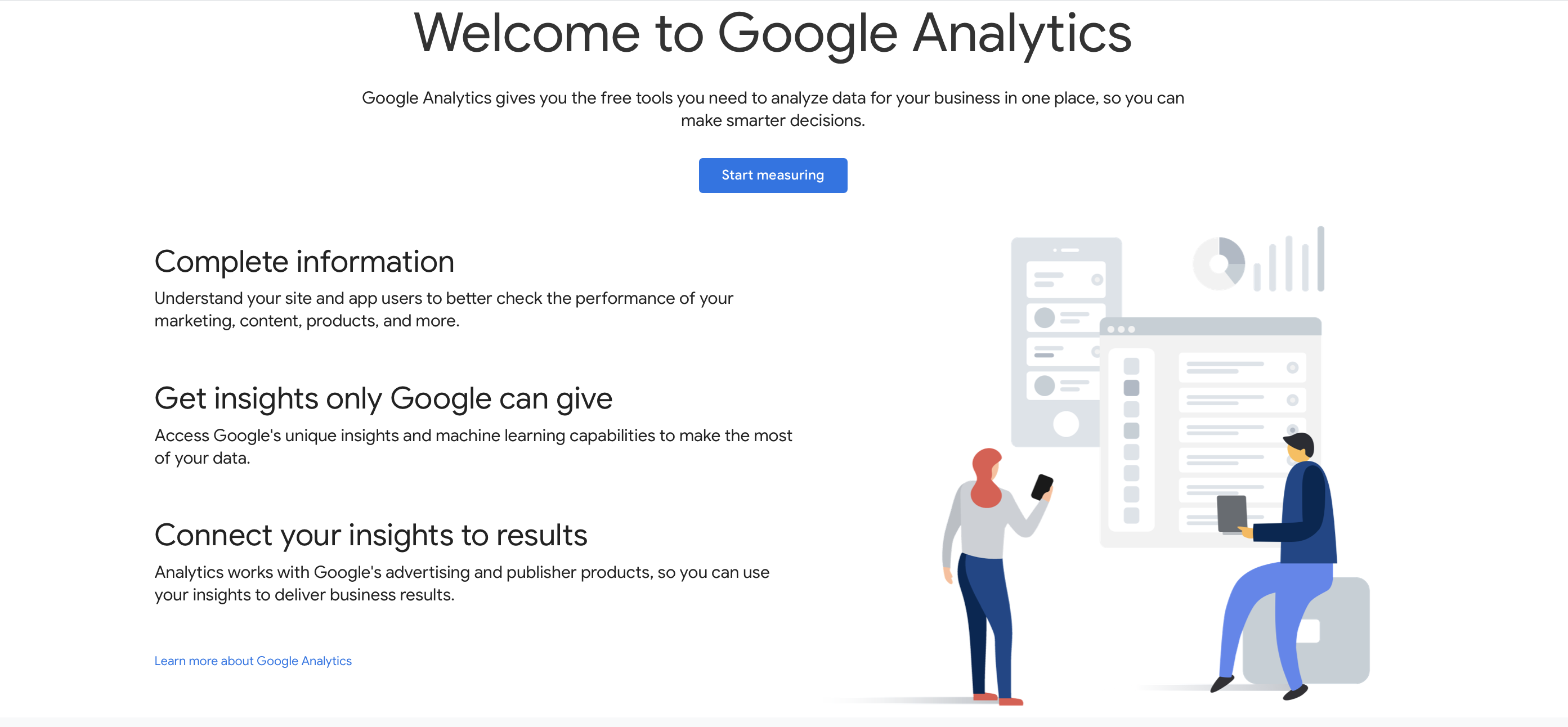
A sales page is your 24-hour salesperson. It basically does all the selling for you 24/7. I guess we can call them the MVPs of selling. To put it another way, sales pages have higher goals than a typical product page or landing page. Rather than focusing on downloads, signups, or click-throughs (all of which are important for generating and nurturing leads), sales pages actually visitors into paying customers. With an effective sales page, you can explain your product or service to visitors and encourage them to buy it right there. However, to make sure you get your sales page right, or if this is the first time you’re creating a sales page, you might want some tips to make sure your page is optimized. We’ll also go share some of our favorite real-world sales page examples. You might find inspiration and learn a thing or two from them. Compelling copy is the foundation of any great sales page. And as all copywriters would agree, compelling copy comes from knowing your target audience. This makes it extremely important to do your market research. It’s the only way to better understand your audience. You’ll be able to empathize with your audience better if you understand their pain points, what they like, as well as any possible objections they may have. Having that information will help you personalize your copy accordingly. Tracking user activity with a program like Google Analytics is one way to obtain useful data. This allows you to see the activities, demographics, and interests of your website visitors. You can also analyze your customers’ social media analytics to learn more about their interests and preferences. Another way to learn more about your audience is to simply ask them. Surveys and questionnaires can be a simple and effective approach to learn more about your customers. Plus, you’ll better understand what they want. A subheadline should appear beneath your big and bold headline. Its job is to elaborate on the key promises of your offer. In comparison to your headline, your subheadline should have a smaller font size. It’s also more likely to be lengthier to better describe your product or service and its benefits. Given that your sales page’s copy is its bread and butter, it makes sense to start there. After all, it is the one who does the hard lifting when it comes to product selling. Plus, it will be so much easier to add the copy to the most appropriate sections while you’re designing your layout. It’s important to connect the features of the product/service to real-life situations whenever you write your copy. You can do that by answering the following questions as best you can: It’s also a good idea to anticipate doubts or objections customers might have about your product. You can address their concerns even before visitors get the chance to voice them out. After addressing your customer’s pain points and the long-term effects it might have on their life, you should immediately introduce your offer. After all, you’re positioning your offer as a solution to their problem. This is the perfect time for you to present your program or product in detail. Talk about how it can benefit your customer internally and externally. Then emphasize how your program, service or product is the quickest way for them to get results. You want them to know they don’t have to struggle much longer. Your product will solve it for them right away. A complicated offer scares away potential clients. Customers don’t have the time or attention span to try to understand what you’re selling. They won’t stick around if they don’t understand what you’re offering them right away. Make an offer that visitors won’t be able to refuse, even from the moment they see your headline. Start with a benefit of the product or service, then describe it. Reduce it to a single, succinct statement. Let’s take this sales page for example, Ruby is a virtual receptionist that businesses from varying industries can use to automate their process. The proposition is simple: save time and focus on running your business. All the while ruby takes care of your customers for you. Breaking the content into bulleted or numbered lists is one way to give your sales page more “breathing room.” You are not required to write full sentences or bulky paragraphs. You can always make lists with bullet points, checklists, etc. Lists with bullets and numbers are useful since they draw attention to themselves. They’re also easier to scan, which makes anyone reading happy. Graphics let you deliver information more quickly and aesthetically engage your audience. A page with images, videos, animations, and illustrations is more engaging to look at. More clients could be persuaded with the help of visual content, especially videos. You can even shoot a video to demonstrate and explain the value of your product or service. The first thing you need to think about when writing your CTA is what you want your customers to do. Think of the CTA as your customer’s response to the headline. What do you want your audience to do with your offer? Let’s take a look at Dinnerly’s sales page. Their headline and subheading is followed by the perfect CTA. The copy for their CTA button, “Start Cooking,” is witty and not your conventional “learn more,” “sign up,” or “buy now.” Remember, don’t be afraid to explicitly ask your visitors to take action. You don’t want to confuse them with what you want them to do, so it’s better to be clear and straightforward. Another thing you can do to find the perfect CTA is to test which ones perform the best. The more you test, the better your CTA will get. There’s nothing wrong with having many CTAs on a long-form sales page. Just make sure they all lead to the same conclusion. The goal is to keep reiterating what you’re asking for. Remind visitors why they’re on your sales page in the first place. They can either read the rest of the page or convert right away. Either way, you’ll be the one benefitting. However, you don’t want to pack 30 CTAs onto a sales page. That would drive the visitors crazy and probably annoy anyone who reads the page. Make sure there’s enough information between each CTA to entice people to keep reading. A great example is Amber Housley’s long-form sales page. She uses multiple CTAs throughout her page, but it never feels stuffy. That’s because she has enough information between each CTA. Customer reviews or social proof helps online shoppers make purchasing decisions. It’s important for persuading clients that a product or service is trustworthy and dependable. Show credibility and build trust by including testimonials, positive reviews, and client success stories on your sales page. It can add more weight to your claims and effectively reduce objections or concerns. You can collect testimonials and positive reviews on your website, social media sites, or by personally contacting customers. If you’re having difficulties picking which submissions to use, look for ones that speak clearly about how the product benefited them or how it addressed their pain points. Guarantees are great for increasing conversions. They make customers feel safe. Assume you’re planning to buy a mattress for $1000. You’ve set a budget and discovered two alternatives on two different websites. One of them has a warranty, and the other doesn’t. Which one would you trust more? Urgency is an excellent sales page strategy. Think about it, instilling a sense of urgency will push customers to make quick decisions. And that’s exactly what you want. You could try adding a pop-up that says “flash sale” to boost conversions. You’re offering a discount if the visitor takes action within X hours. Desire can also be used to generate urgency. This is something that financial advisors do all the time. They might say something like, “Do you want to triple your revenue in a year? What are you waiting for?” FAQs are also quite helpful. It’s a quick way to communicate information without detracting from the conversion process. It’s the perfect place for you to respond to any potential objections that customers may have. Anticipate the problems your potential customers might have with your product or service. Then explain why they won’t be a big deal. Provide them with solutions when you answer their questions. Some of your answers to these questions can get extremely long. So we suggest designing the FAQ section in a way that’s easy to read and won’t look cluttered on your page. FAQ sections won’t overwhelm visitors as long as you use strong subheadings and plenty of white space. Now that you have your social proof and compelling copy, it’s time to proceed to your sales page’s design and layout. Your sales page can either be long-form or short-form format. It all depends on the amount of information you need to present to your visitors. No matter the format you use, it’s critical you keep the most important information “above the fold”. This is the portion of the sales page that customers see first, even without scrolling. It’s also essential that the content is simple to read and skim. Using bullet points, lists, and altering the placement of images and text are examples of how you can do this. These days it’s essential for businesses to have responsive sites on desktop and mobile. You don’t want to give visitors an excuse to abandon their shopping cart, especially when they want to buy from you on their tablets or phones. Make sure you optimize your sales page for different screen sizes. Hire a programmer or developer to keep your page responsive and fast. Once you have your copy and sales page designed, it’s time to test and modify to maximize your conversions. Conversion Rate Optimization (CRO) is a process that involves tracking data and doing split tests (also known as A/B testing) to determine the best-performing page setup. For example, you could be unsure about whether to utilize a long-form or short-form sales page. One of these solutions might perform much better than the other for some businesses. But without testing, it can be difficult to tell which is more engaging for your audience. You can test your: Now that we’ve gone over some tips you can use to improve your sales page, let’s look at some of the best sales pages online. We’ll be taking a closer look at some high-converting sales page examples to see why they succeed. Slack’s sales page is a great example of a high converting sales page. It does a fantastic job of presenting product features through interactive content. The sales page shows the product, its features, how it works, and what customers can expect from getting it. Why it works: ConvertKit is an email marketing platform for content creators. The sales page does a great job of guiding users through the page using design and copy. It’s a smart strategy that garnered impressive results. Why it works: Dinnerly is a meal box subscription service for budget-conscious home cooks. Their sales page is colorful, appealing, and tailored to a specific Reddit audience. Why it works: Dr. Hyman’s Eat Fat, Get Thin program teaches you how to lose weight and increase your energy levels. What makes this sales page great is that it addresses consumers’ concerns while providing a viable solution. Why it works: AdEspresso is a course that teaches Facebook and Instagram advertising to business owners, marketers, etc. Why it works: Hopefully, these tips will help in creating epic sales pages that entice readers to buy. While all these tips will help you, keep in mind that a successful sales page is always evolving. As you learn more about your target market, your sales page will most certainly change. Continue to fine-tune your messaging and have faith in the process. If you or our company need help designing and developing a successful sales page, reach out to our team! We’ve helped countless clients design their websites, landing pages and sales pages, and most importantly, we’ve helped them drive traffic that converts. Sales Page Tips
1. Know Your Audience
2. Start With a Strong Headline
 The goal of your headline is to persuade visitors to read the rest of the sales page. While it’s the first thing visitors see on the page, it might be the last thing you write. You might even get your headline in the process of writing the rest of your copy. Remember, the headline should be bold and clear. It should be able to properly communicate what your offer is.
3. Follow With a Supporting Subheadline
4. Write Copy That Addresses the Pain Points of Your Customers.
5. Introduce Your Solution
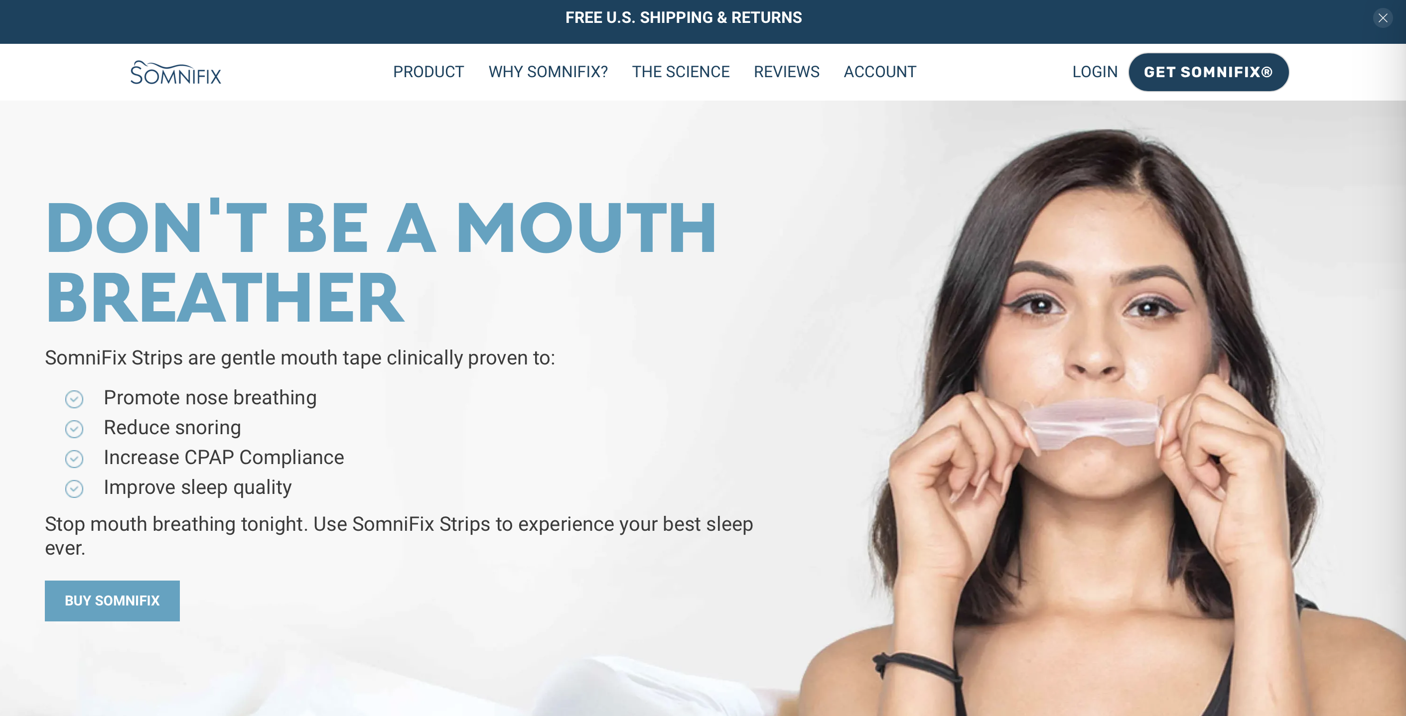
6. Make Your Offer as Clear and Simple as Possible
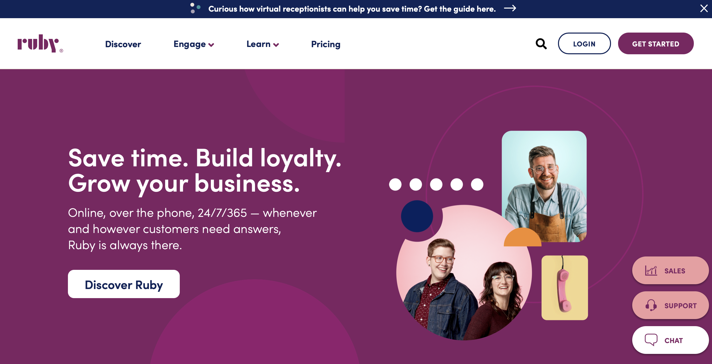 The headline “Save time. Build loyalty. Grow your business.” tells you what ruby does clearly. Combined with the subheadline, then you’re already sold on the idea.
7. Add Lists and Bullets
8. Spruce Up Your Sales Page With Visual Content
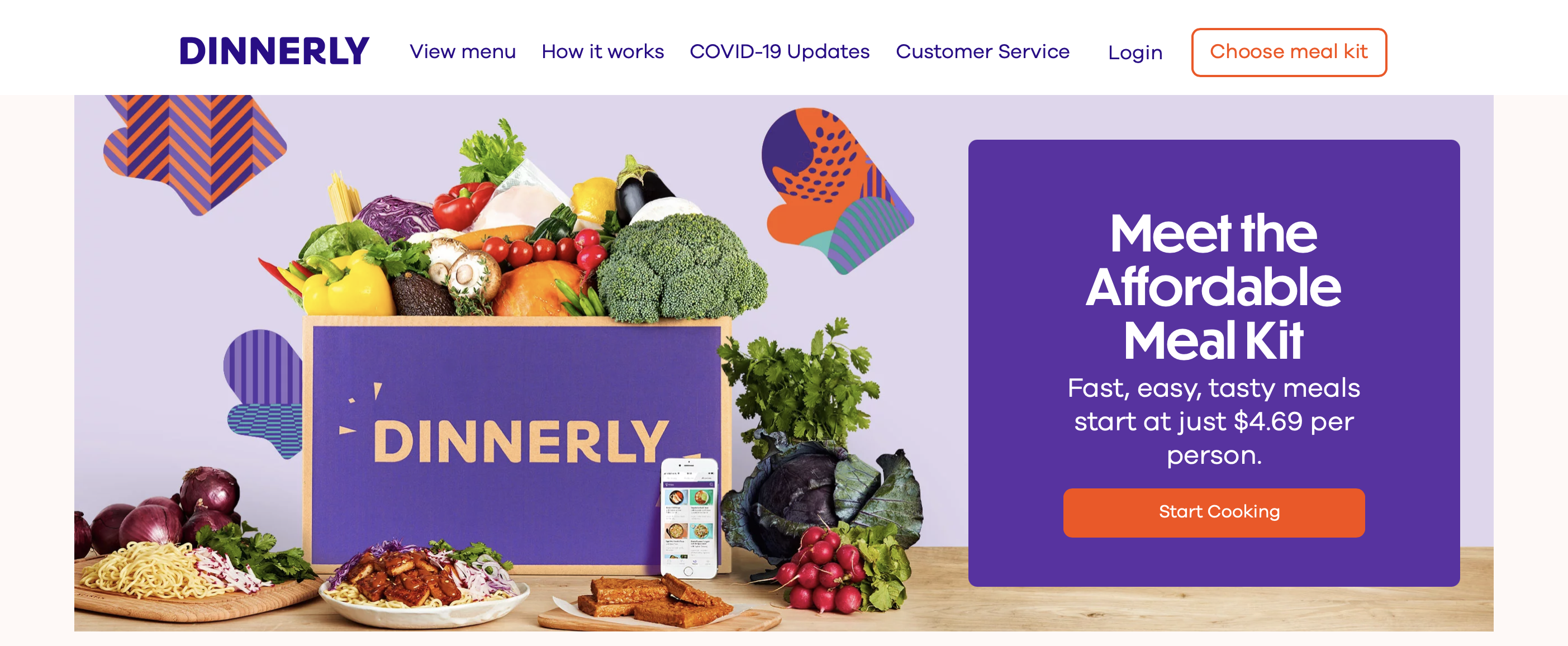
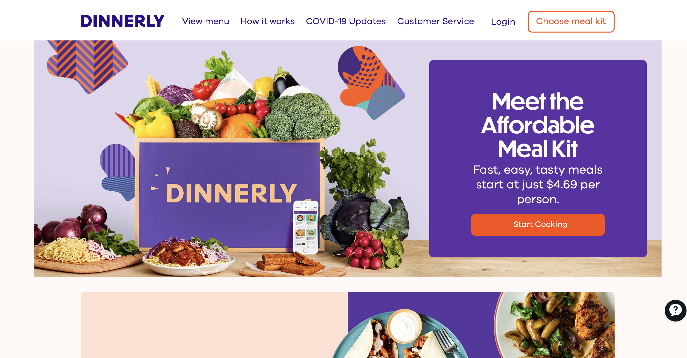
9. Write the Perfect CTA
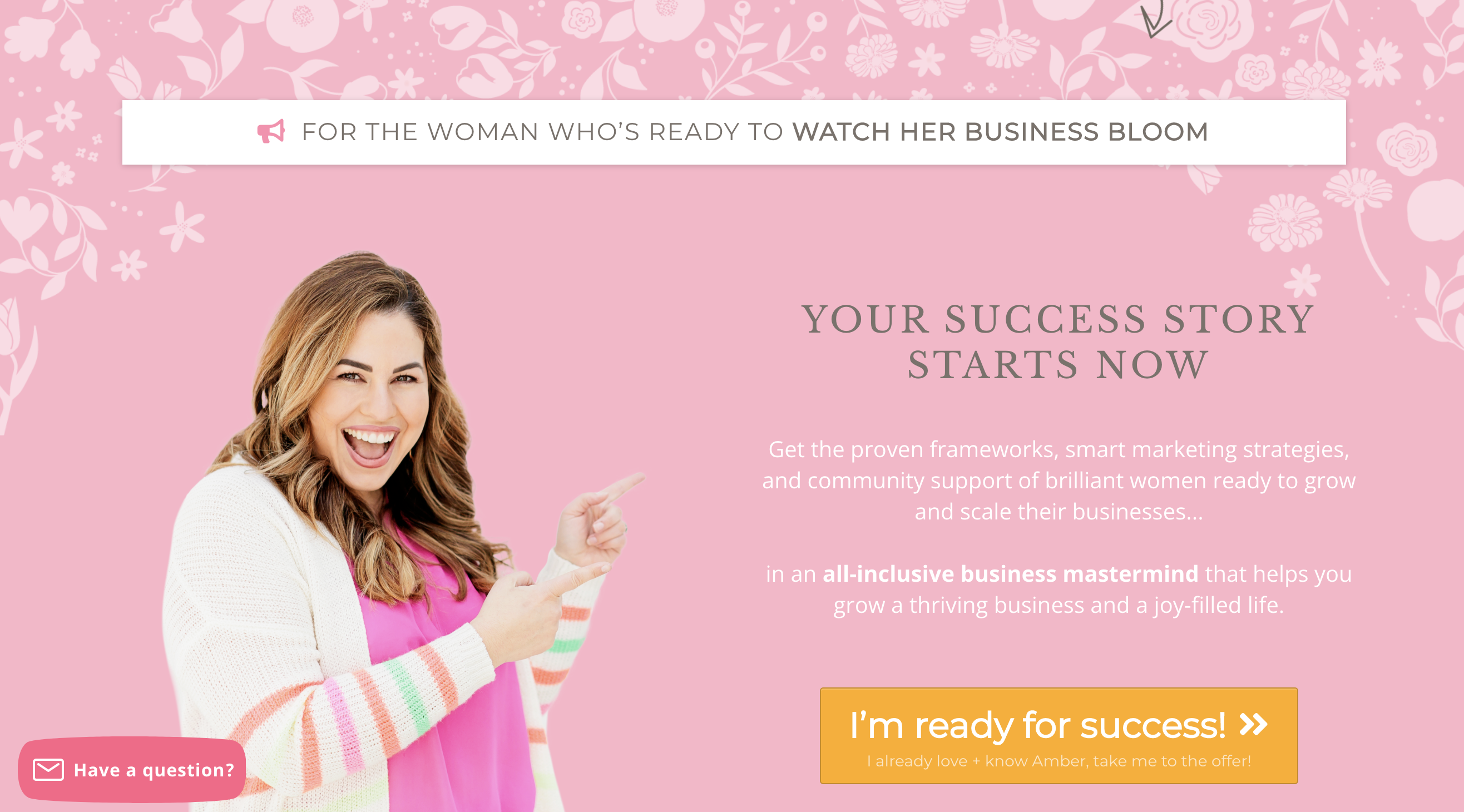
10. Use Multiple CTAs
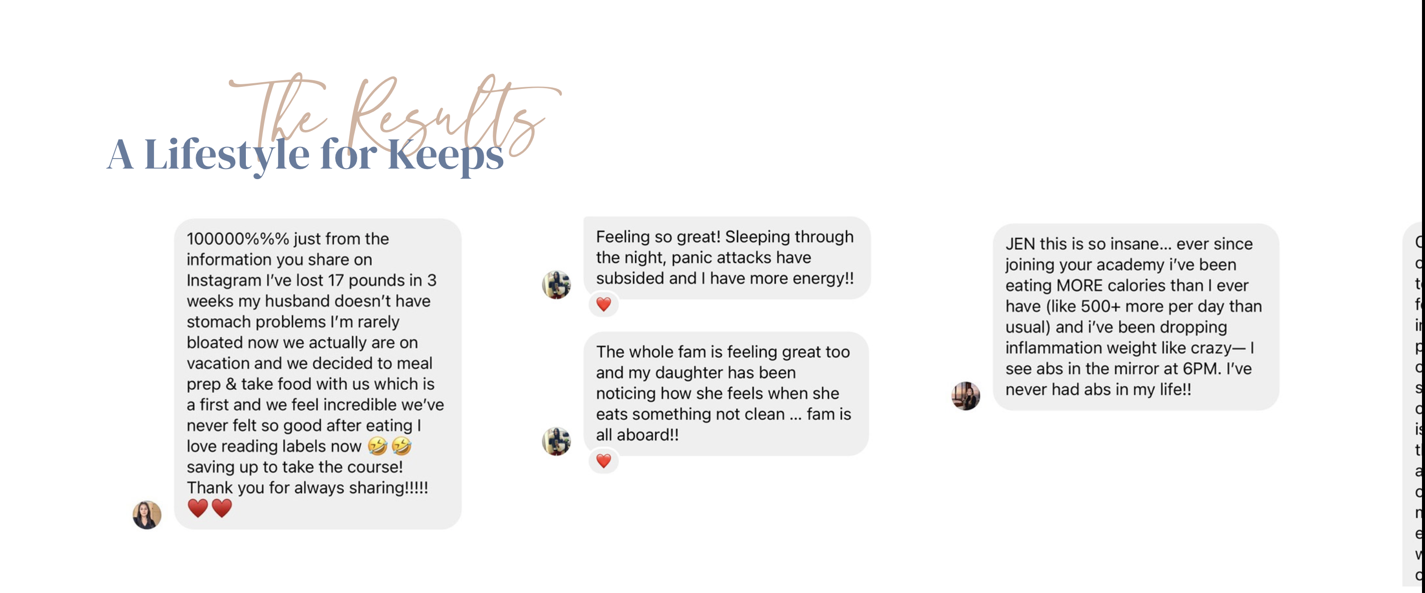
11. Leverage Social Proof
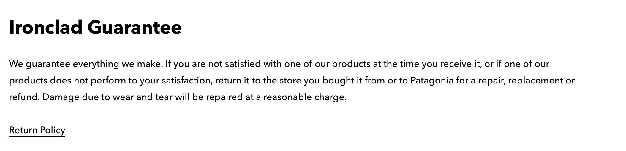
12. Provide Customers With a Guarantee
13. Make It Urgent
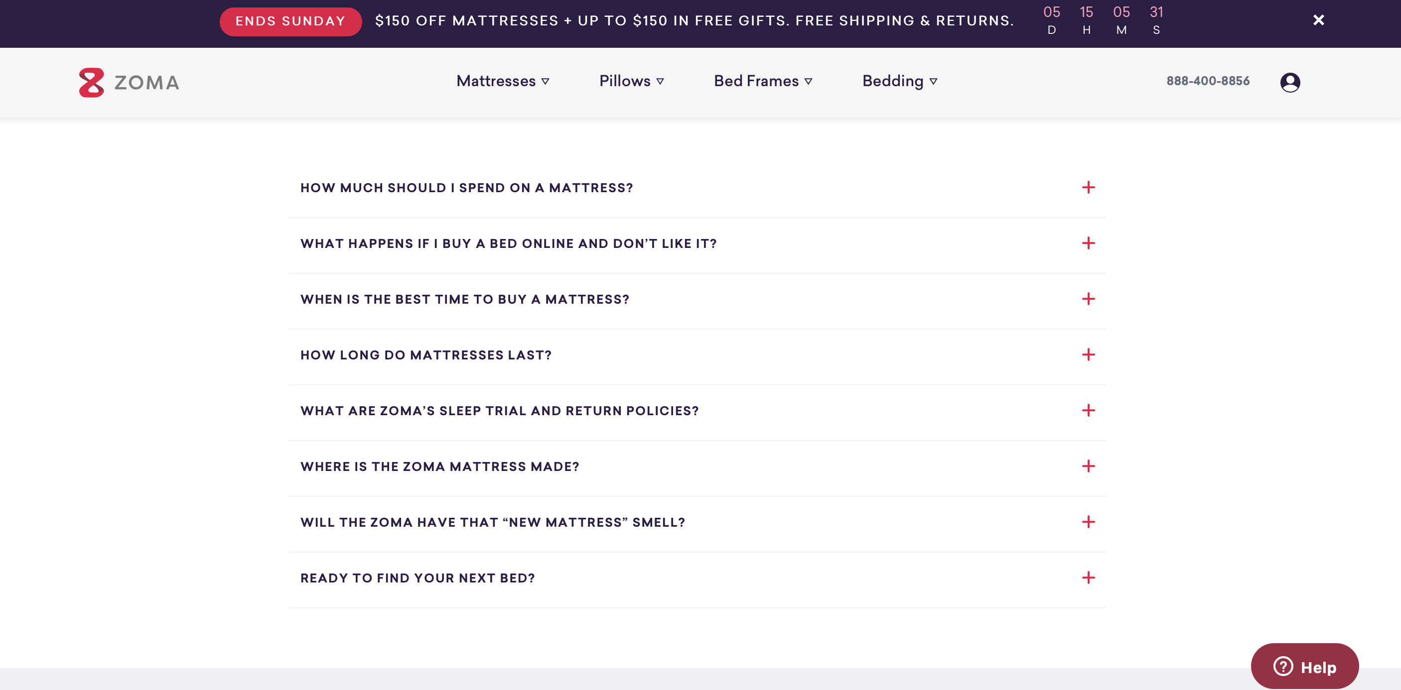
14. Handle Objections With an FAQ Section
15. Design to Convert

16. Optimize Your Sales Page
17. Test Your Sales Page
Best Sales Page Examples
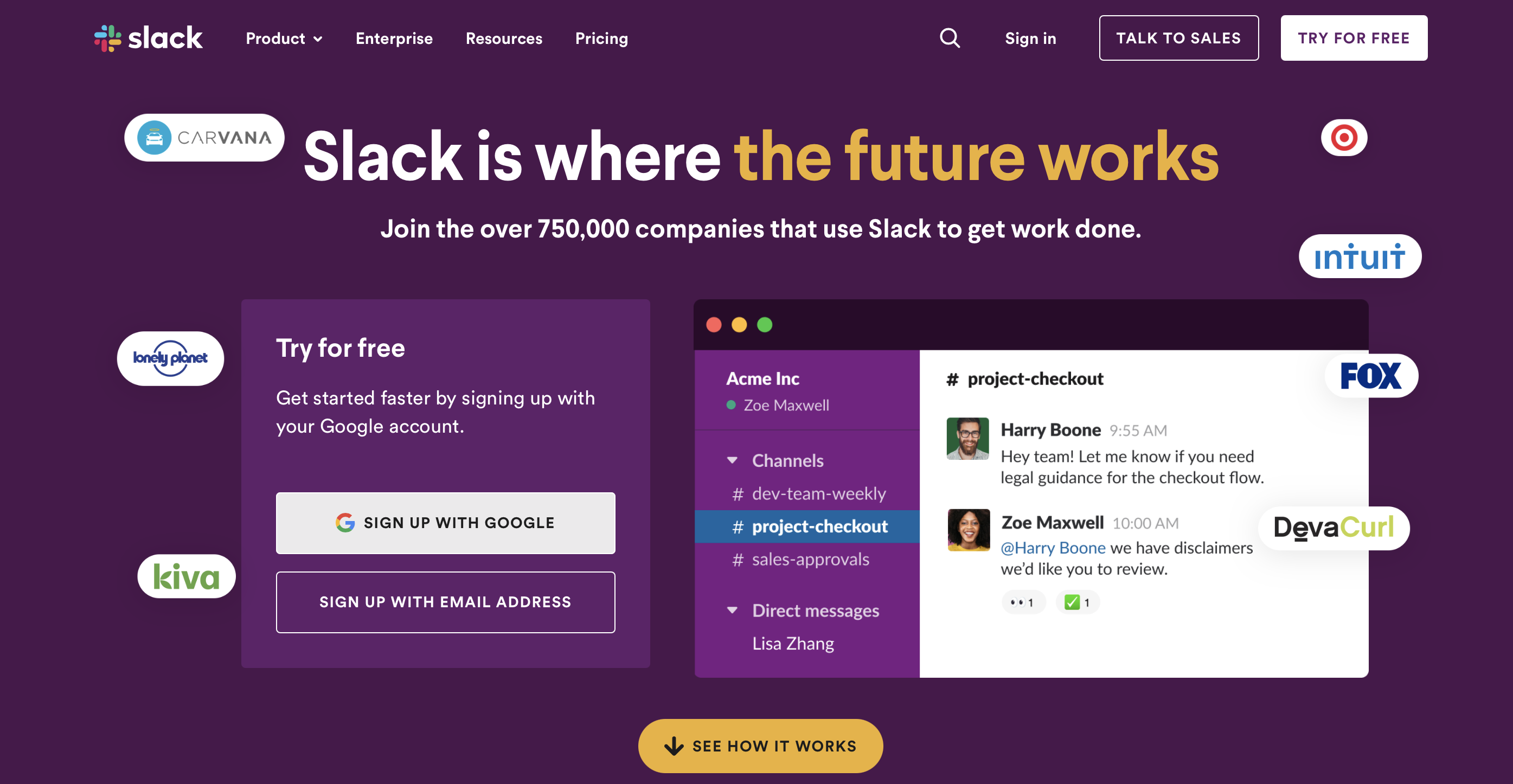
Slack
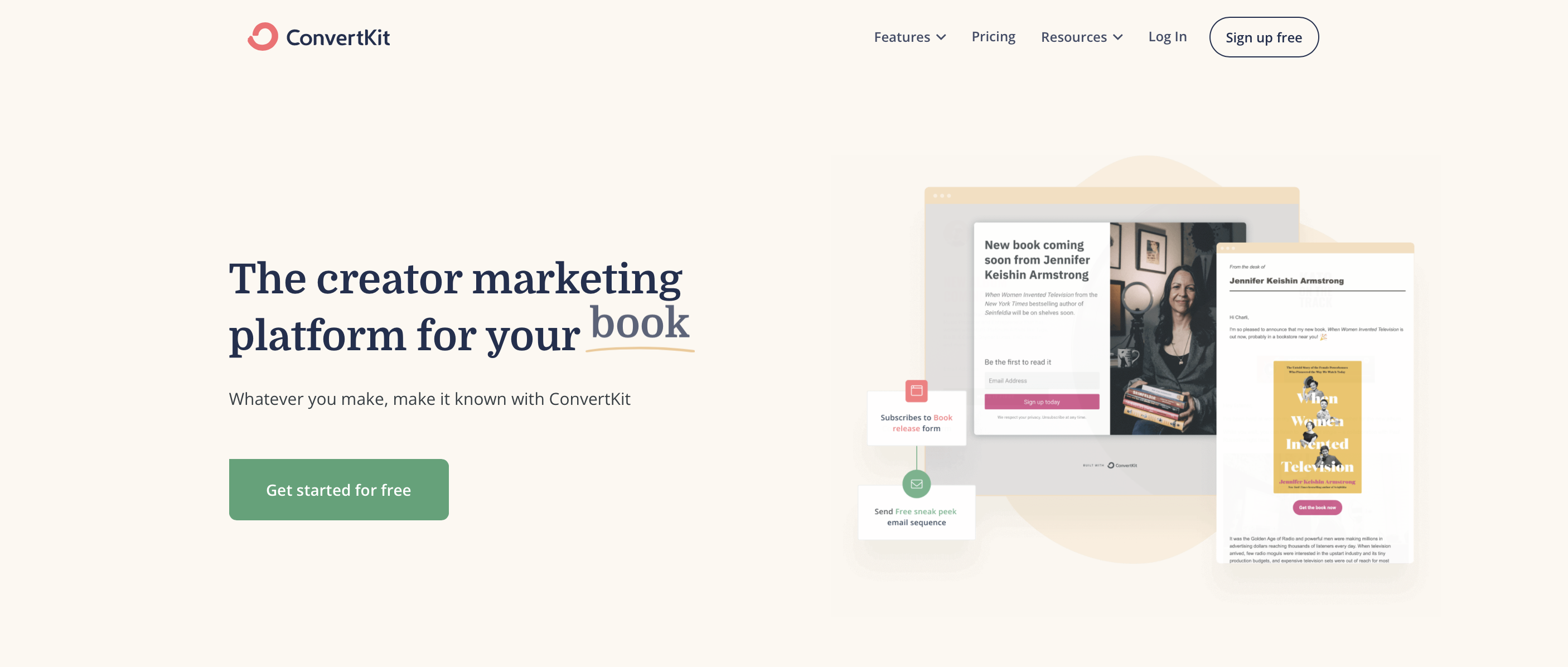
ConvertKit
Dinnerly
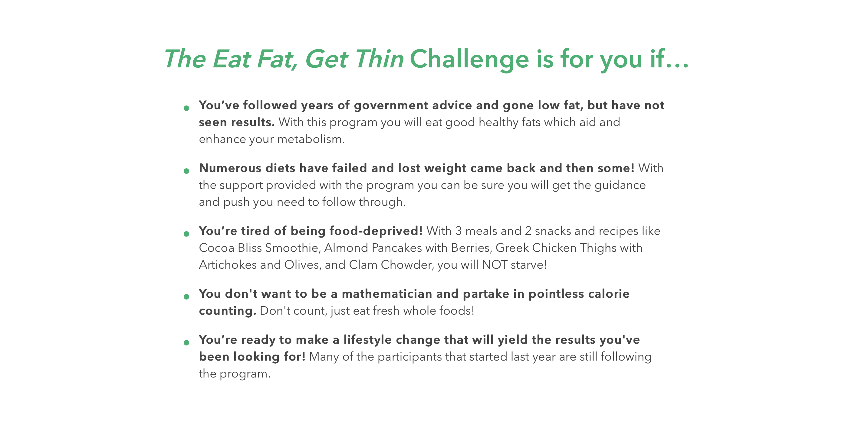
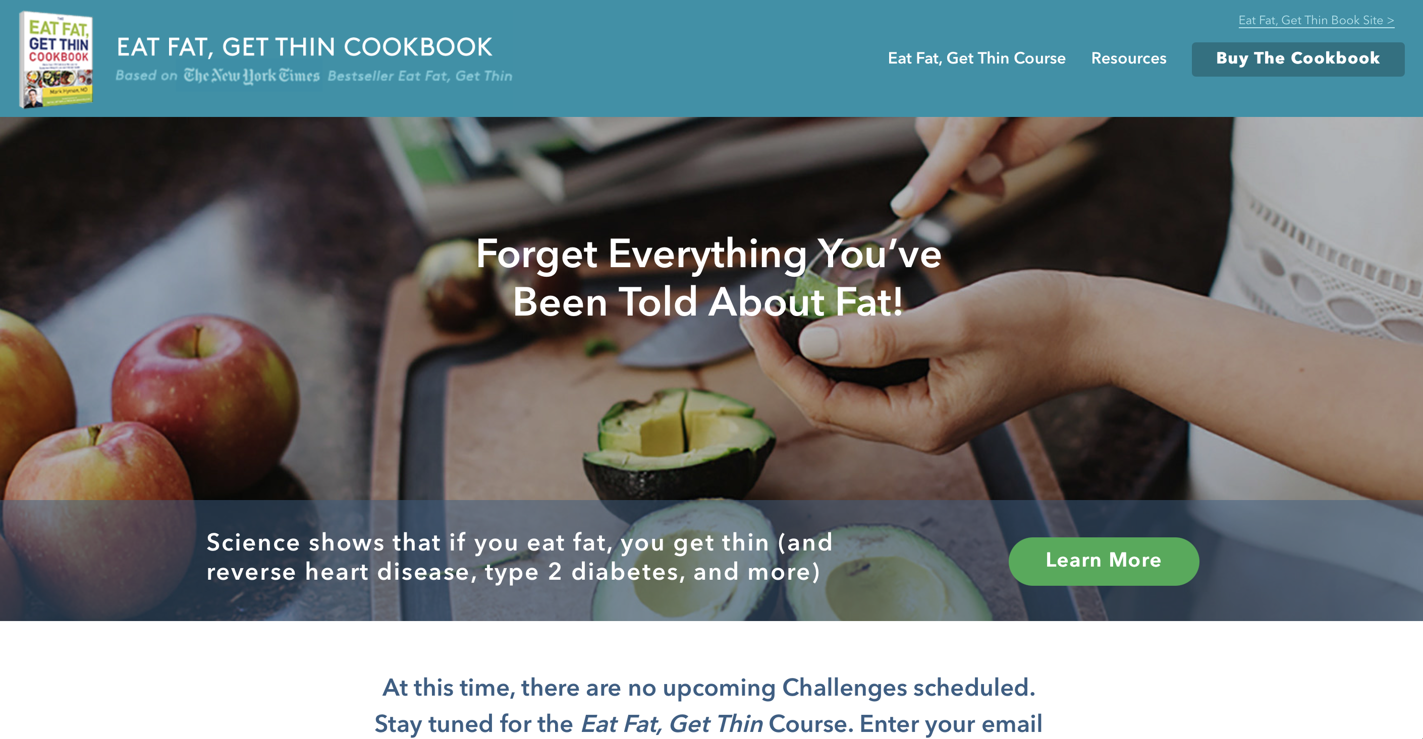
Eat Fat, Get Thin
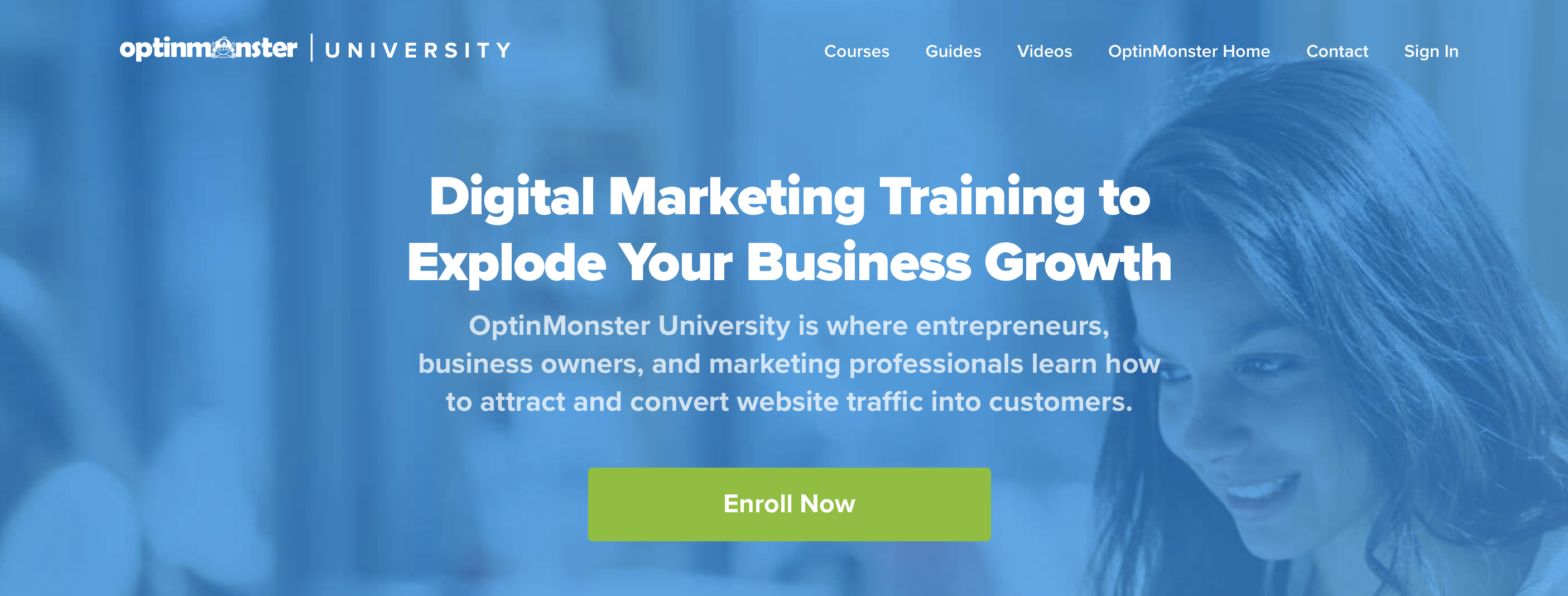
AdEspresso University

Sales Page Tips Conclusion
With Just Digital,
Success is Easy-Peasy Lemon-Squeezy.
When life gives us lemons, we generate results. Contact us today and we can start making lemonade.