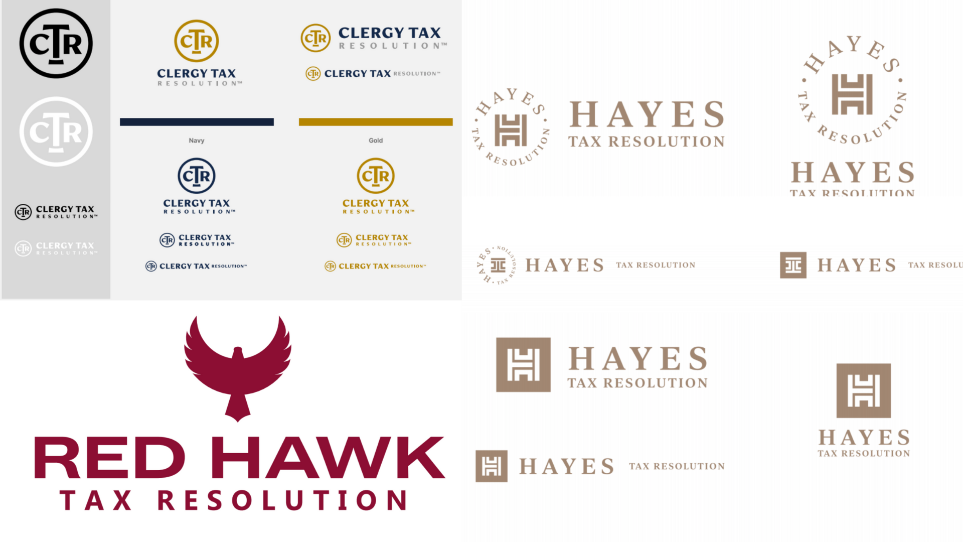
Logos, some people think they’re just symbols, but are they are so much more than that. You may not believe it, but logos and the different logo types are much more nuanced and significant than you think. A logo is a visual representation of your company’s branding. Despite the fact that logos come in a variety of shapes and sizes, each one is a blend of an image and typography. Any brandmark you see has a distinct appearance and feel. Your logo and website aren’t necessarily your brand. Your business’s identity is defined by the experience and perception that customers have of it. The steps taken to create your brand are referred to as branding. A brand identity, on the other hand, is the physical manifestations of your brand. However, your logo is significant to your brand because it conveys ownership, consistency, and values. It’s imprinted on your merchandise, business cards, websites, products, social media, and, most notably, in your clients’ heads. Your logo is going to be one of the first things people see when they come into contact with your brand, and it’s your chance to make a good first impression, demonstrate that you provide excellent service, and visually articulate your mission. If you’re thinking about getting a new logo there are a few things you need to know and consider. In case you didn’t know, there are ten different logo types you can use for your company — all of which we will be dissecting and discussing today. Logos are icons made up of text, symbols, or pictures that help us recognize brands we trust. Your brand’s foundation is built on a strong logo. It clarifies what you do, who you are, and what you value to your clients. A strong logo communicates a company’s mission and ideals. The goal of logo design is to create the ideal graphic brand mark for an organization. Depending on the logo types, a logo typically consists of a sign or brand mark and a tagline. Maybe the most basic feature of a logo is to provide a company with a distinctive symbol that distinguishes it from competitors. This is particularly important if you’re in a competitive industry. Before you get a logo for your company, do some homework and research how your competitors’ logos are designed so you can position yourself. Above you can see three different logo designs we’ve created for some of our tax relief/resolution clients. They each have their own distinctive logos that are unique to their business. A strong logo not only distinguishes the brand but also gives your customers important facts about it. It should communicate what products or services you offer, who your target audience is, what industry you’re from, and your brand values. For example, an organization could incorporate dental imagery or symbols into their logo to indicate that they work in the dental industry. They may also choose a specific color palette to communicate their message. They may also use a sleek font to emphasize that they are opulent. The example we have above is for our very own client SC Aerotech. They are a leading research and advisory firm focused exclusively on business aviation. On their logo, you can see a small plane slicing through their brand name. Logos leave a visual impression on your clients. To put it another way, logos have the ability to establish clear visual associations with a brand. Customers will remember your brand as a result of this association. Consider brands like Nike or Adidas, whose logos are so well-known that they can be remembered even though the name isn’t said. It’s no wonder that logos are so important to a company’s branding. Now you know what a logo is and what it does, but are you aware of what logos are made of? To be frank, there is no definitive answer. But there are a few common elements we can often see in a logo. When it comes to design, a logo would almost always have a typographic element. It can be anything from a monogram single letter to an abbreviation, or the company’s full name. Symbols or icons are often used in conjunction with typography. They can be symbolic or made up of abstract geometric shapes. Logos may also have graphical elements like line work or visual punctuations that don’t inherently produce a distinct, autonomous image. Color naturally comes after form. There are no rules when it comes to choosing a color palette for your logo. It can be black and white, monochrome, or multicolored. Color palettes with multicolored logos are often analogous, or colors of equivalent hues, or contrasting, or colors with dissimilar or opposite hues. In some cases, the context in which a logo is used is also important. Your logo can be defined by your customers in the way you use it. As a result, it’s important to consider where and when logos can be seen by your customers. Logos are often used on the internet, on business cards, in storefronts, in ads, and in print. However, your company may have unique needs. The choice to produce a static logo (one that looks the same anywhere it exists), or a dynamic logo (one that varies based on its context) is an important choice within logo design. Take note of how the elements in the illustration shift based on how you use them. As you already know, size refers to how small or big an object or feature is. When it comes to elements of a logo, scale is frequently about the relationship between one object and the others in the vicinity. The bigger an object is, the more visually noticeable it is. A strong logo is unforgettable, distinguishes you from the competition, and encourages brand loyalty. How do you do it? Imbue it with meaning. Why should you do this? Since your brand is based on your company’s belief system, core beliefs, purpose, mission, and vision. What matters most to consumers is their view and what your brand stands for. On the surface, good design looks professional, but it also represents something deeper. A good logo establishes credibility and encourages customers to return and support your brand. It informs prospective customers of who you are, what you do, and how you can help them. It conveys to those who have no previous knowledge or familiarity with your company that you do excellent work. People would certainly distrust your ability to provide products and services if your logo appears unprofessional. Develop a strong logo to help you stand out to customers, ensure that they know your name, and form positive associations with your brand. Logos have a strong symbolic meaning that is linked to people’s memories and feelings. Make a significant investment in the creation of your brand’s logo. It’s the most important factor in establishing credibility and attracting customers. A logo is one of the most important elements of marketing your company because it serves as a foundation for your brand. If you need more convincing, here are 6 reasons why you need a logo: The first thing your customers look for is your logo. Many of the marketing materials, such as business cards, posters, and commercials, should feature your logo prominently. If you don’t have a logo, you’re losing out on a chance to make your company resonate in people’s minds. Consistency is what customers want. Your logo will become more familiar to a wider spectrum of customers as your brand expands, and this familiarity will build the impression that your brand is trustworthy and approachable. If your customers end up liking you and your brand, they will likely seek you out time and time again. And what do you think they will look out for first? Your logo! Make a statement with your logo and it will show customers that your brand is different. With the use of the right symbol or font, a well-designed company logo will convey anything from the company’s history to its mission. You can say your logo serves as a vehicle for communicating your ideals as well as demonstrating to customers that you are better and different from your competitors. Your logo directs people to your company. Customers know your brand because of your logo. So it’s safe to say it serves as a point of identification. People should be able to immediately associate seeing the logo with a memory of what your organization does, and, most importantly, how it makes your customers feel. Since a strong logo is a visual, aesthetically appealing product, it helps people remember the brand in ways that your brand’s name alone would not. Some of your audience might even forget your company’s name, but they’ll instantly equate your logo with their experience with your brand. Simply put, effective branding is about sharing a story that can affect consumers’ emotions. Even though logo design is just one component of a company’s identity, it acts as the basis for the whole story that the brand is based on. The story you’re trying to tell determines the colors, styles, and fonts you use. Your logo sets the tone for that story. These features can be carried over from your logo to all of your promotional products, including letterheads, business cards, webpages, landing pages, and so on. This will help create a tangible, marketable brand identity. You just have one shot at getting this right. Your logo serves as the first point of contact with customers. It will pique the public’s attention and encourage them to learn more about the organization if it’s well-designed; if it’s not, you’ve just potentially lost a future client base. This is the opportunity to communicate mastery over the products you sell or the niche you conquer. Your company’s logo will establish your brand as a leader in your field right away. Even Though logos are all made up of typography and photographs, each style of logo has a distinct vibe. And, because the logo will be the first thing potential buyers see, you’ll want to get it right. Here are 10 logo types to help you choose which type of logo to go for. Brand marks, also known as pictorial marks, are logos made up of a visual emblem or icon that typically depicts a physical object. We’re talking about the plain and straightforward, like the outline of a car or a coffee cup. The object may say a story about your business or make a play on your company’s name. Brand marks are simple and easy to recall. If you have a particular service, a picture that depicts that service will deliver a short and direct message to your target audience. Additionally, the design’s simplicity can translate well when resizing the logo through branding materials such as business cards or letterheads. If you’re a new company with few followers, proceed with caution. Although a brand name is always the distinguishing feature of brands we deem legendary, you must first be well-known. Otherwise, the logo could not convey enough information about you to your target audience, causing them to lose confidence in your brand. A single pictorial symbol can be difficult to understand. It works well if you already have a well-known name. If the company’s name is too long to explain what it does graphically, you can use brand marks to your benefit, and they can even be used to easily convey a desired concept or sentiment. If the business model is likely to evolve in the future, a pictorial label might not be the right option. You can begin by selling pizzas and incorporate a pizza into your logo, but what happens when you expand to include cookies, tacos, or even burgers? Abstract logos are those that need you to see the big picture. It’s often an abstract geometric shape that depicts your company rather than a recognizable image. Abstract markings, as all logo icons, perform well because they condense the brand into a single illustration. Abstract logos, on the other hand, encourage you to design something entirely original to reflect your brand rather than being limited to an image of something familiar. An abstract logo, like a brand mark logo, is made up of just one symbol – but it’s one that’s custom-made for you. This image isn’t meant to resemble a real-life object; rather, it’s a one-of-a-kind logo that expresses something specific about the business. The advantage of an abstract logo is that it allows you to symbolically communicate what your organization does without focusing on the cultural implications of a single picture. You can give your brand sense and foster emotion by using color and shape. Since an abstract logo isn’t bound by the constraints of a real-world entity or images, you have a lot of leeway to say whatever you want about your company. A well-thought-out abstract mark could be the perfect logo for you, particularly if you’re a company that does a variety of things! Another thing to think about is how logos with a lot of complexity in the design do not look right when printed at various resolutions; hence, work with a logo designer who knows how fonts, colors, and shapes work together. Abstract logos enable you to create a truly unique image for your company, but they’re better left to designers who know how colour, form, and structure work together to create meaning. If, for example, a company name does not lend itself well to translation, pictorial and symbolic markers fit global commerce. Mascots are photos of a character or individual that serve as a graphic symbol of the company. They are arguably the most friendly form of logo. Consider them your brand’s “spokesman”; they’ll also be the focus of a lot of your ads. Consider your mascots to be your company’s envoy. Mascot logos are ideal for businesses that wish to cater to families and children in order to build a positive environment. Consider all of the mascots at sporting competitions and the fantastic atmosphere they generate by interacting with the crowd! Mascots give their fans a warm and fuzzy experience, resulting in a brand that is easily remembered. Furthermore, nothing appeals to children more than a physical, relatable character. Recognize that Mascots cannot deliver the same message if the company’s emphasis is on global innovation or if you’re selling a non-child-friendly commodity. A mascot’s main advantage is that it can inspire customer engagement, making it an excellent platform for both social media and real-world marketing activities. Keep in mind that a mascot is just one component of a popular logo and brand, and you will not be able to incorporate it into all of your marketing materials. An extremely detailed illustration won’t print well on a business card. These logos are made up entirely of text, such as brand names, initials, or monograms. In essence, a logotype is simply a business name set in a specific typeface. A wordmark is a font-based logo that relies solely on a company’s name. When an organization has a short and distinct name, wordmark logos perform very well. Typography would also be significant, just as it is with a lettermark logo. Since your name will be the highlight, you’ll want to use a font—or build one—that captures the essence of what your company does. Fashion brands, for example, use clean, glamorous fonts that sound high-end, while legal and government departments almost often use conventional, “thicker” text that feels safe. When anyone sees a wordmark, they don’t have to make any guesses on the organization it serves. Logotypes are one of the most flexible logo choices because the style is just in the lettering. They can be quickly transferred onto any publicity content. If your business name is memorable, take the opportunity to emphasize it and use it to your benefit. Is there something about your business name that describes what you do? If you aren’t well-known, or if your company is named after an individual rather than an idea, it may be difficult to achieve the level of market awareness that a logo can help you achieve. It is a wise choice to use a wordmark if you’re a new company, make sure your name is short and catchy enough to fit in with the style. Anything that is too long can seem crowded. Your brand would be much more memorable if you use a well-designed font for your name. Lettermarks, also known as monogram logos, are typography-based logos that spruce up the look of a company’s abbreviated initials. They can also be made up of symbols that form the company’s initials. The lettermark logo is all about keeping it simple. Lettermark logos are good at streamlining any business brand if it has a long name by using just a few letters. Since the emphasis is on initials, the font you use or produce is critical in ensuring that your logo is not only on-theme for the company’s mission, but also legible when printed on business cards. Often, if you’re a new company, you might want to have your full business name below the logo so that people can get a sense of who you are right away. Acronyms are all over the contemporary world, from our intimate speaking styles to our luxury automobile manufacturers. They’re also straight to the point: lettermarks transform the long company name into a distinct brand identity. Monograms might be a perfect choice if you’re a new/small company that wants to get your name out there because they’re pretty simple to create. Know how to use different fonts. The logo’s simplicity should work in your favor, but make sure you’re not left with a bland, forgettable design. The beauty is in the details. Often, on promotional items, you might want to consider embossing your company’s full name under your logo so that people can see the connection between your lettermark logo and your brand name. Both lettermark and wordmark logos are simple to reproduce throughout marketing materials and branding, making them highly adaptable choices for a new or growing company. When making a lettermark or a wordmark, keep in mind that accuracy is important. Your company name in a single font is unlikely to be distinctive enough to convey the nuance of your brand. As a result, make sure you recruit someone with a keen eye for details. If the company has a long name, think of a lettermark logo. Condensing your company’s name into initials will help simplify your design, and consumers will remember your company and logo more easily. Letterforms are one-letter logos that are the minimalist counterparts of monograms. Naturally, these logos should be bold and majestic, and well-designed. Especially since a letter alone cannot express a simple meaning. Letterforms are conveniently scalable. If your logo is only one letter, you can put it anywhere and it will always look great. In addition, a well-designed letterform can subconsciously conjure up the full name of the business. Since these logos only consist of one letter, the way it is designed becomes critical. If the logo isn’t iconic, it’s useless. This may indicate a unique font, a dramatic background, or an intriguing color scheme—basically, something that makes the letter stand out and resonate. If your logo is only one character, you want people to be able to decipher it, so make sure the font you choose is legible. As the name suggests, combination logos integrate and blend all images and words into one logo. Logos with combination marks can be made up of any combination of images and text. It may be made up of a pictorial mark, letterform, abstract mark, or mascot, as well as a combination wordmark or lettermark. Whichever mixture most appeals to you. The image and text may be placed next to each other, layered on top of each other, or combined to form an image. A combination logo is a flexible option since a brand’s name is synonymous with the image. In a combination logo, both the text and the symbol or mascot are working together to promote the brand. People will immediately equate your name with your mascot or pictorial mark if you use a combination logo. You will be able to depend only on a logo symbol in the future, rather than having to use the name every time. These logos are often easier to patent than a pictorial mark alone because the combination of an emblem and text creates a distinct image. It’s the most versatile logo type out there. Combination logos also make rebranding a breeze. As we’ve said, your brand’s name will be synonymous with an image, symbolic or otherwise, such that your consumers will inevitably still see the sign and still think about your brand. Versatile doesn’t mean you have to be excessive. Consider how your name and symbol can fit together, and keep your logo concept simple and on-brand. A combination logo is an excellent option for almost any company. It’s adaptable, one-of-a-kind, plus it’s the most common logo design among major corporations. Badges, seals, and crests are examples of emblem logos. Emblem logos are popular because of their traditional look, which makes them a good choice for many universities, organisations, and government departments. From family crests to strong monarchs’ royal stamps, emblems have certainly stood the test of time. Emblem logos are also often used in the automotive industry. In an emblem logo type, a typeface typically sits inside a boundary, like a seal or a crest. Although maintaining a timeless look, several businesses have successfully modernized the traditional emblem look with logo styles that are suited for the twenty-first century. Emblems are unforgettable, and they give the company a sense of professionalism, traditionalism, and value. They also give the feeling that your business has been around for a long time and isn’t about to disappear anytime soon. They are less flexible than the aforementioned forms of logo types due to their greater level of detail and the fact that the name and emblem are rigidly entwined. It would be difficult to reproduce an elaborate logo style through all branding. Consider scalability when designing the logo, as these logos also have more complex designs that do not appear as good when resized. Also, if you want to embroider this sort of logo on merchandise, you’ll need to make a pattern that’s easy, otherwise it won’t work. Because emblems don’t have the same versatility as normal combination logos, make sure the design is perfect before releasing it. As a general rule, keep your style simple and you’ll end up with a solid, bold look that will make you look like a true pro. Many public organizations and schools prefer the conventional look of an emblem, but it can also benefit any up-and-coming private sector, including those in the food and beverage industry. Still, be cautious when it comes to the details of your logo. You still need a logo that can be printed consistently in all of the marketing materials. Dynamic logos may be defined as the logos of the future. This style of logo, unlike others, adapts to the context in which it is used. This means that instead of using a single font, colour, and text combination in the logo, these elements will keep changing. Whether that’s on the internet or on various branding materials. You are free to be as creative as you can! You can adapt the logo to any situation or make a variety of first impressions on new customers. Dynamic logos also make it interesting. the crowd will be on the edge of their seats waiting to see what you come up with next. You don’t want to sacrifice your logo’s associative power; some of your fans may associate your brand with your colors, while others may recall the outline of your symbol. If these specifics change often, the logo can not have the same impact as a static logo. Keep an eye on the adjustments you make, and make sure the logo stays on brand. Contoured shape logos are when the brand name is contained inside a geometrical shape, such as a circle, square, rectangle, or other elliptical shapes. The effect of such geometrical shapes on human psychology is the explanation for their existence. Different shapes communicate different signals, such as four lines in a box or other arrangements conveying continuity and uniformity. The message of completeness is represented by a circle. As a result, selecting the form and geometrical shape for a company logo requires caution. A small business logo must be simple and easy to understand to easily engage with your customer. It’s important to keep the logo clear and simple so that it can be used across various media channels and at any scale. Unlike big corporations, most small businesses lack years of brand exposure or a large marketing campaign to make customers appreciate what they do. As a result, the logo would instantly convey who you are and what you do. There’s a lot to think about when it comes to reducing the brand to a single symbol. When it comes down to it, a great small business logo only needs three elements: Fast and cheap isn’t always the best option, particularly when it comes to the company’s logo. Investing time in the planning process has a significant impact. If you’ve just started a business or plan to rebrand, creating a logo for your organization or business should be your first priority. You could design it yourself if you are an experienced artist. But if you don’t have any experience in logo design, it’s a smart idea to seek assistance from an agency that provides graphic design services to create a custom logo for your business. We can help you do just that! Just Digital is a digital marketing and creative agency that creates beautiful logos and high-performing websites. For a logo consultation, please contact us here.
“A logo is not a brand—it’s only a symbol for a brand. A brand is much more than a logo.”
— Marty NeumeierLogo Types— What are logos?
Logo Types— What does a logo do?
Logo Types— A logo differentiates your business from your competitors
Logo Types— A logo can communicate what your business is and what it offers

Logo Types— A logo helps to create a brand identity and increase brand recognition.
Logo Types— Elements of a logo
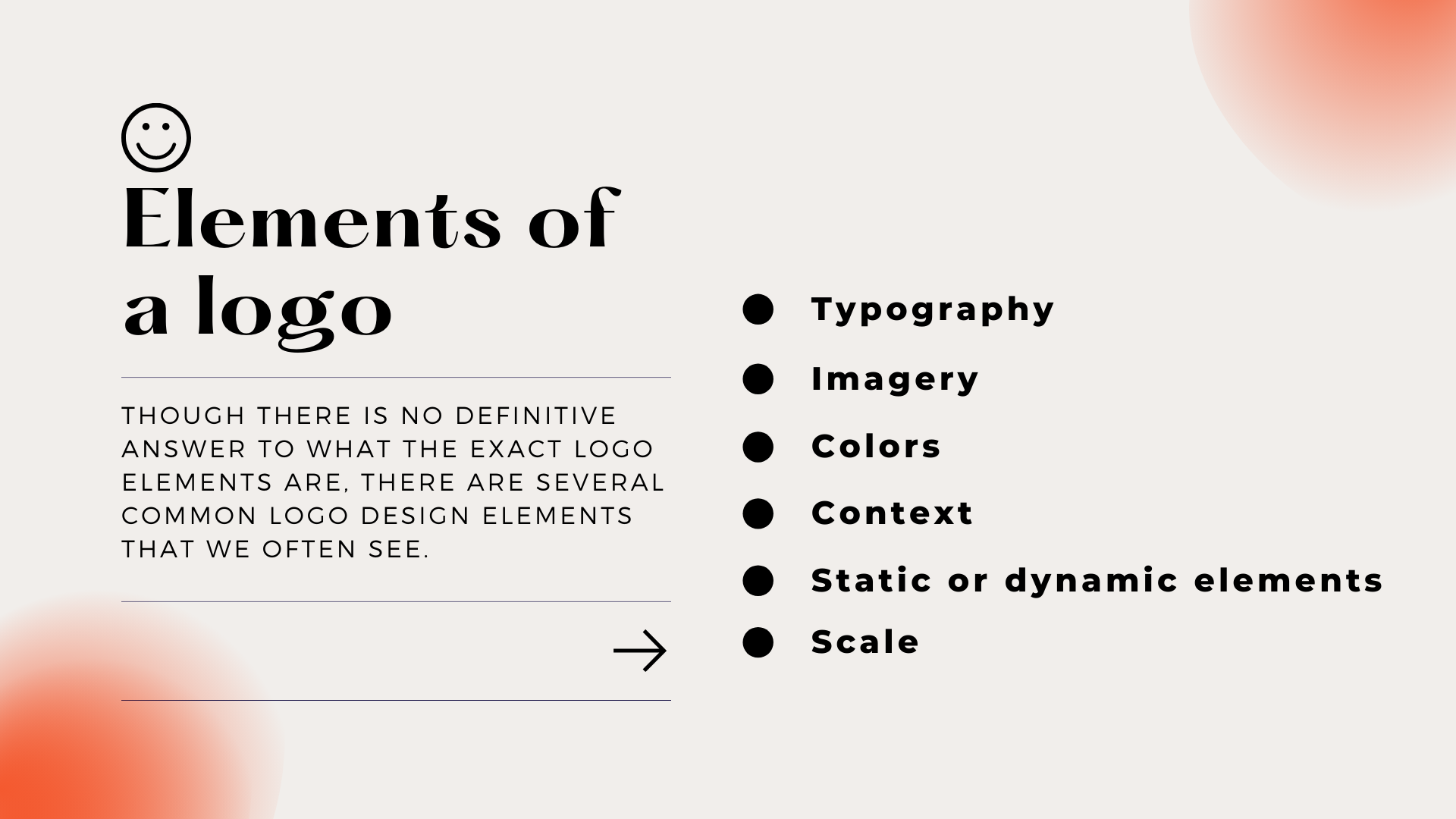
Logo Types— Typography
Logo Types— Imagery
Logo Types— Colors
Logo Types—Context
Logo Types— Static or dynamic elements
Logo Types—Scale
Logo Types— What makes a logo good?
Logo Types— Why does your business need a logo?
“A logo is less important than the product it signifies; it means it is more important than what it looks like.”
– Paul RandLogo Types— Benefits of having a logo
Logo Types— It’s what customers expect from you
Logo Types— It encourages brand loyalty
Logo Types— It sets you apart from the competition
Logo Types— It’s memorable
Logo Types— It is the foundation of the brand’s identity
Logo Types— It creates a powerful first impression
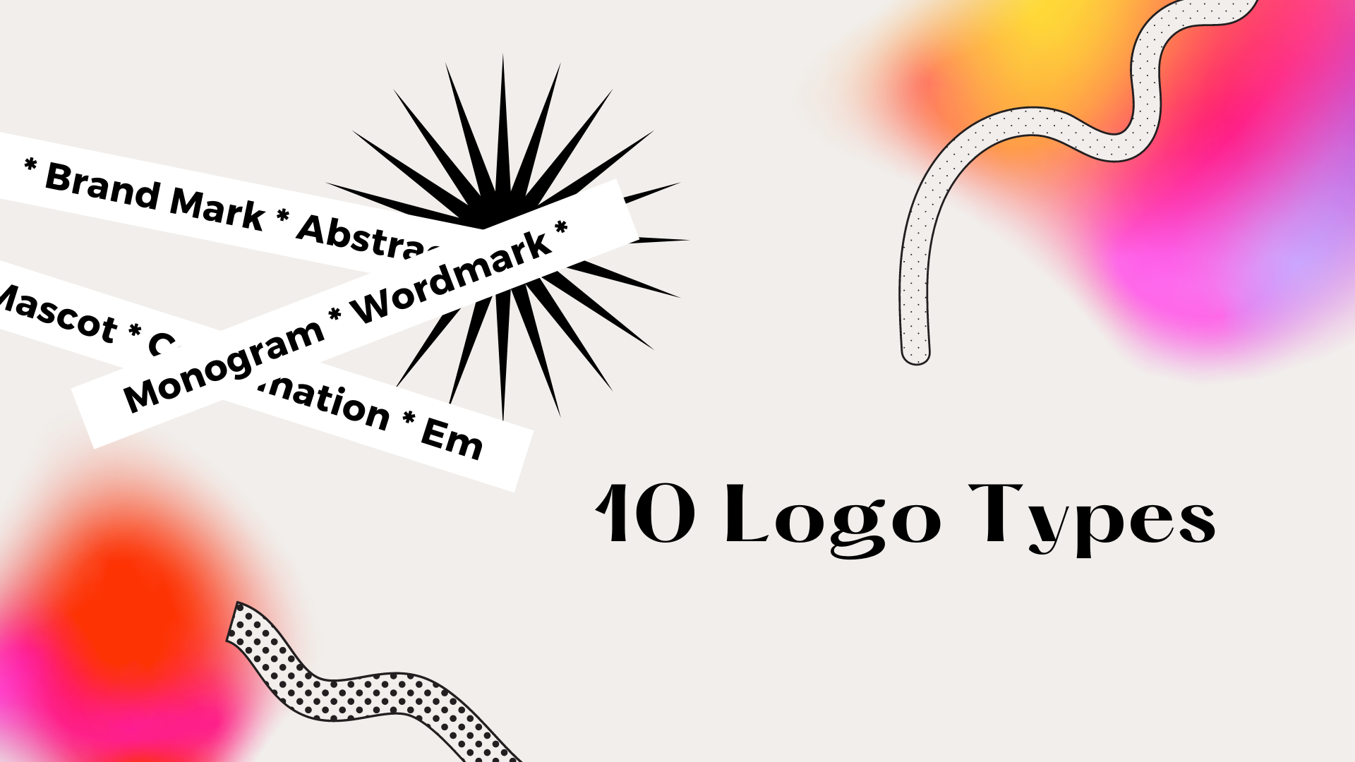
Logo Types— 10 logo types
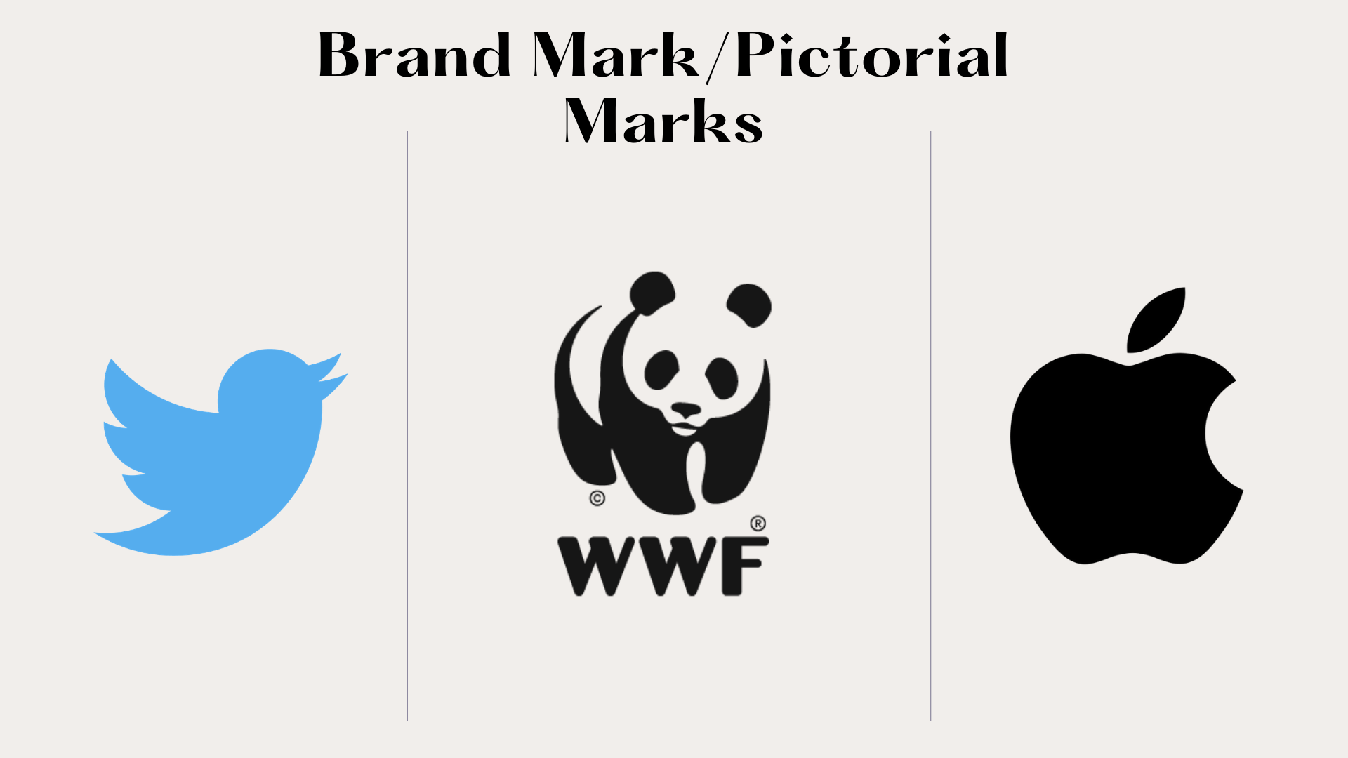
Brand Mark/Pictorial Marks Logo Types
Benefits of a brand mark logo types:
Things to consider:
When to use a brand mark/ pictorial mark logo type:
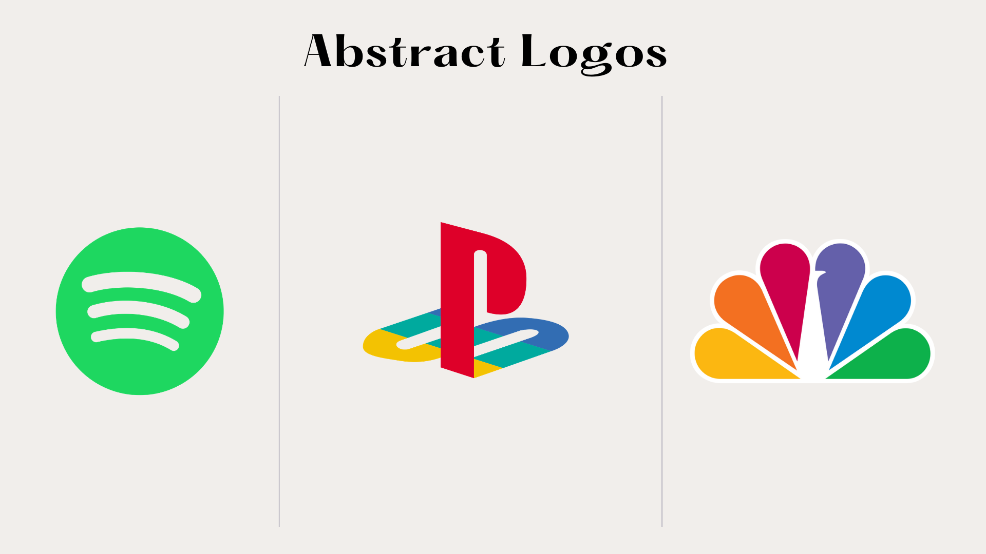
Abstract Logo Types
Benefits of an abstract logo types:
Things to consider:
When to use an abstract logo type:
Mascot Logo Types
Benefits of a mascot logo types:
Things to consider:
When to use a mascot logotype:
Wordmark Logo types
Benefits of a wordmark logo types:
Things to consider:
When to use a wordmark logotype:
Lettermark/monogram Logo types
Benefits of a lettermark/monogram logo types:
Things to consider:
When to use a lettermark logotype:
Letterform logo types
Benefits of letterform logo types:
Things to consider:
Combination logo types
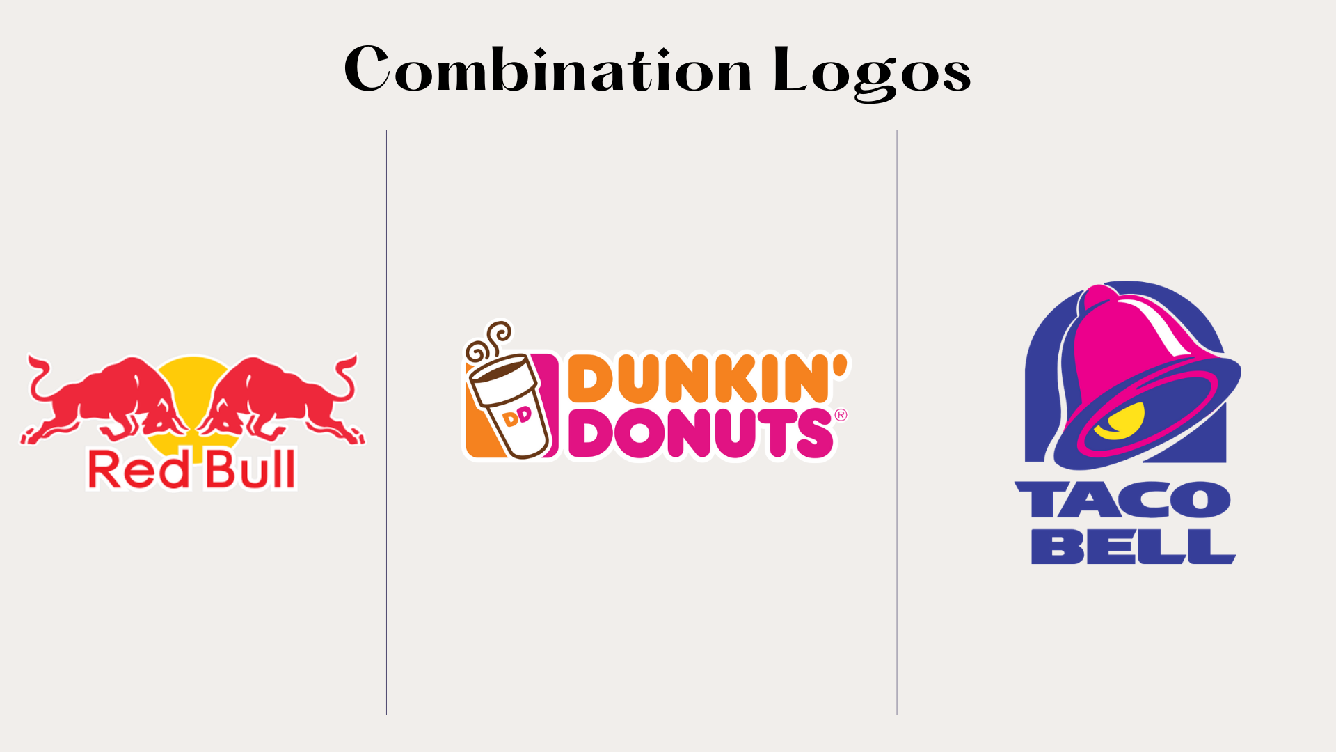
Benefits of combination logo types:
Things to consider:
When to use a combination logo type:
Emblem logo types
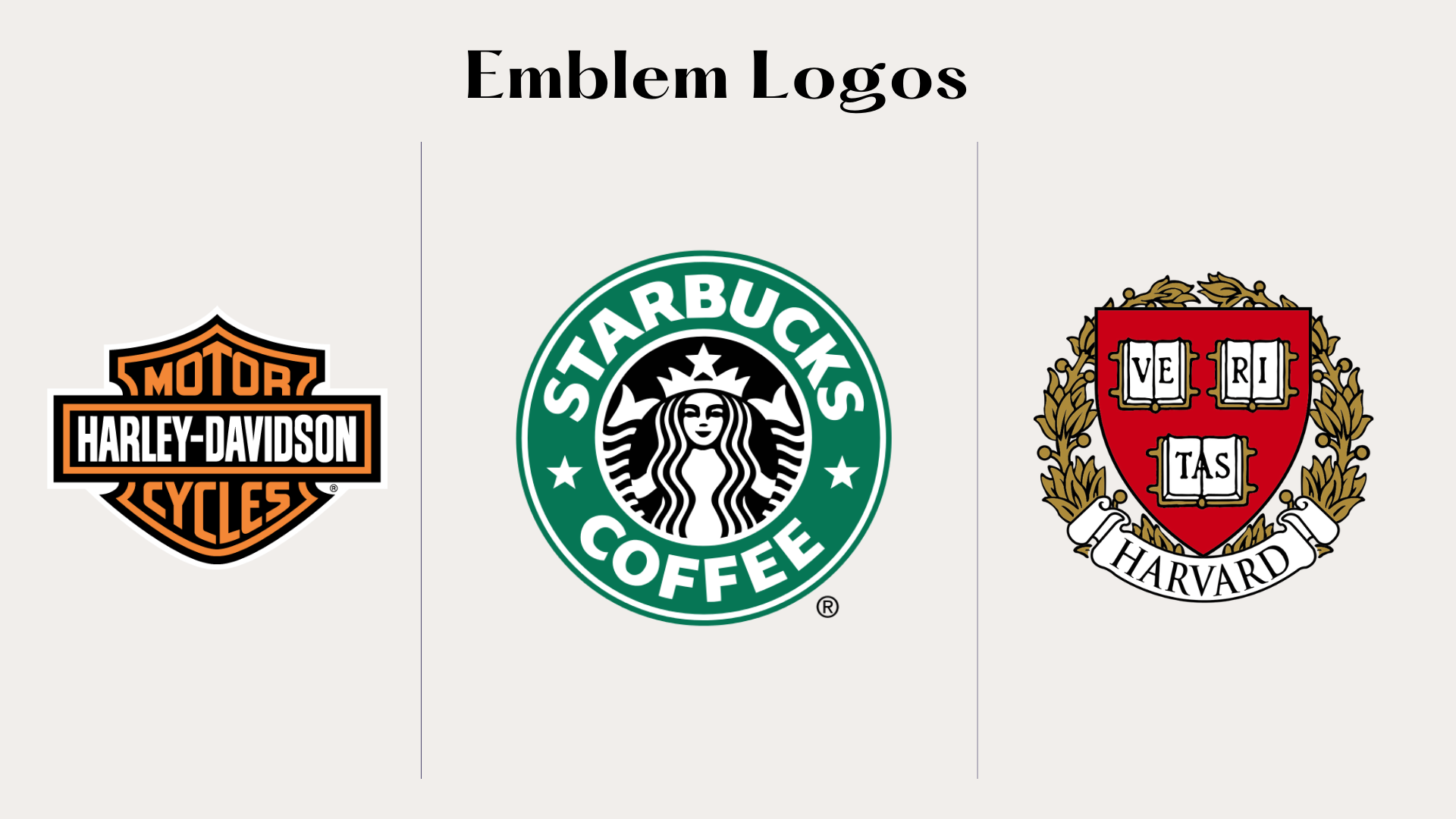
Benefits of emblem logo types:
Things to consider:
When to use an emblem logo type:
Dynamic logo types
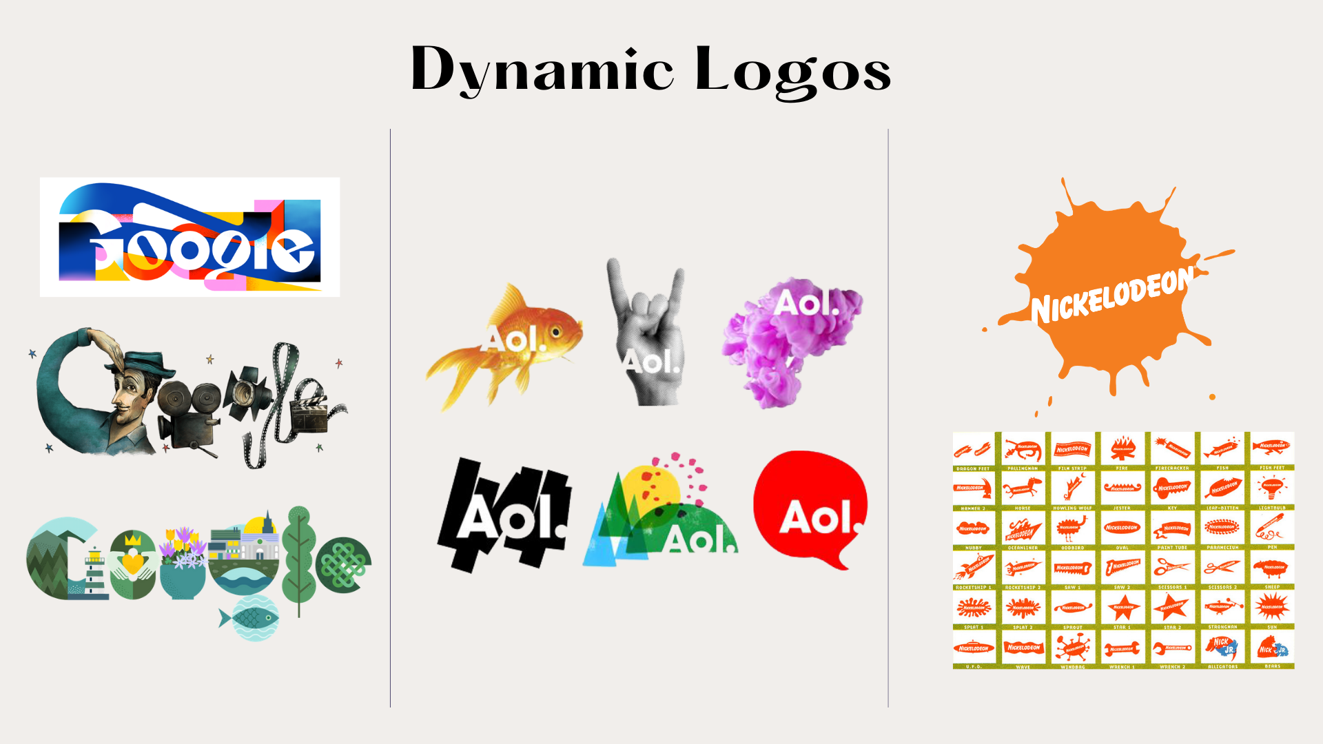
Benefits of dynamic logo types:
Things to consider:
Contoured shape logo types
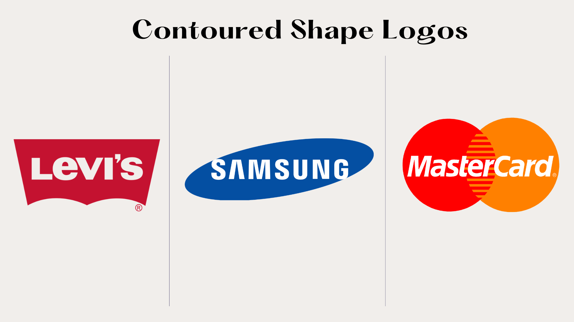
Logo Types— How to create a good logo?
Logo Types—Hire an agency!
With Just Digital,
Success is Easy-Peasy Lemon-Squeezy.
When life gives us lemons, we generate results. Contact us today and we can start making lemonade.

